Bar rebranding
The Old Man. Getting older, getting better
Brand Identity, Design, Rebranding.
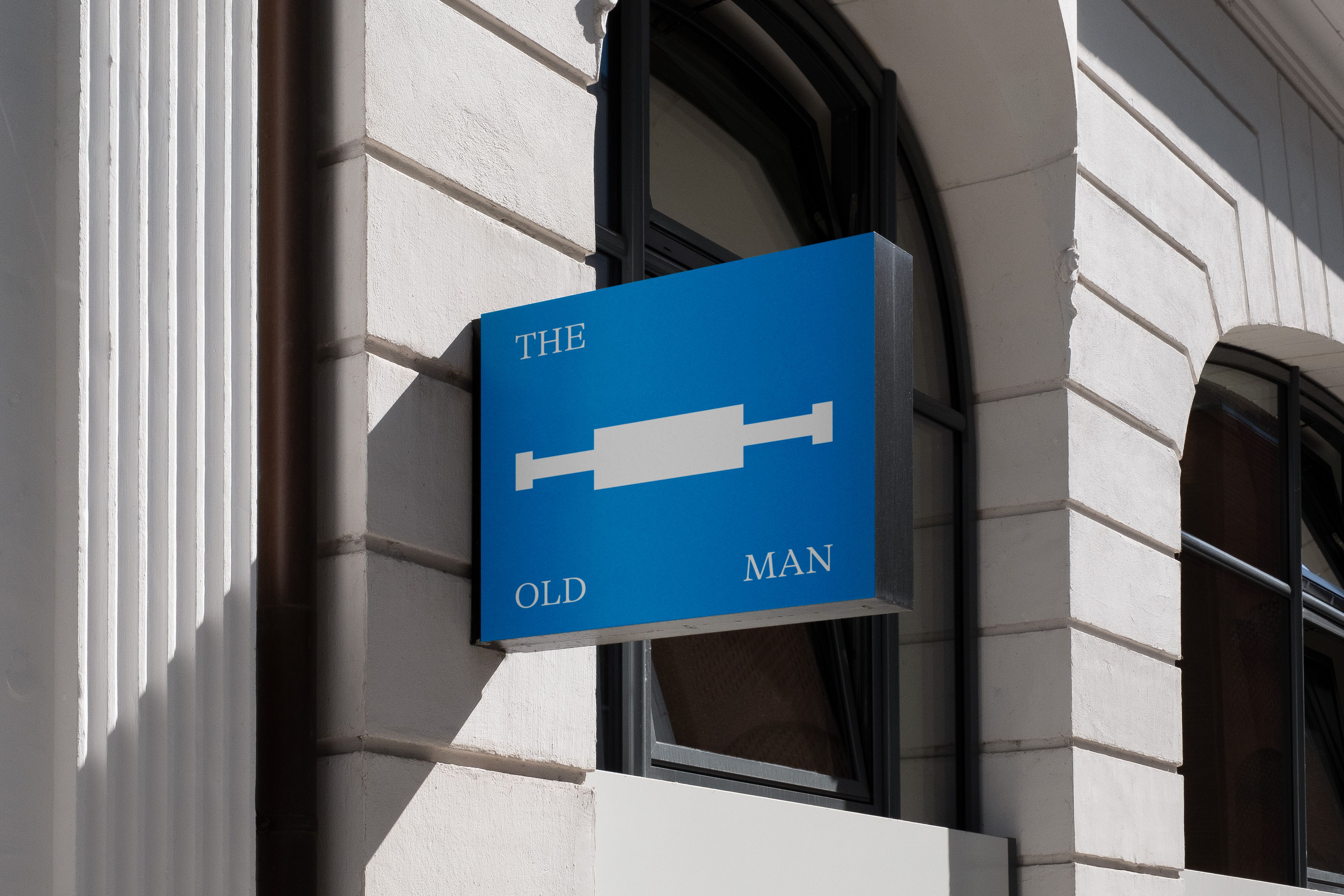
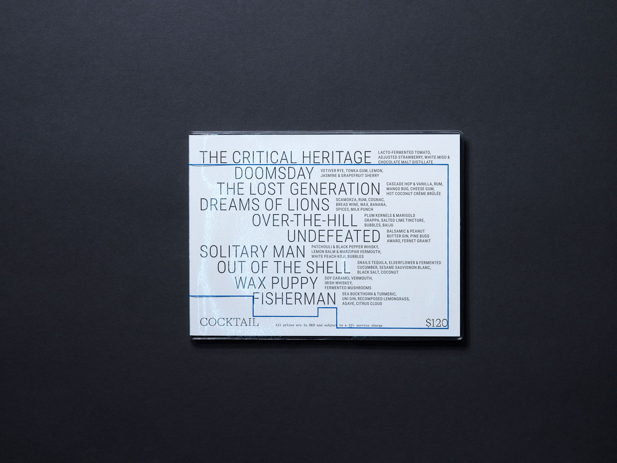
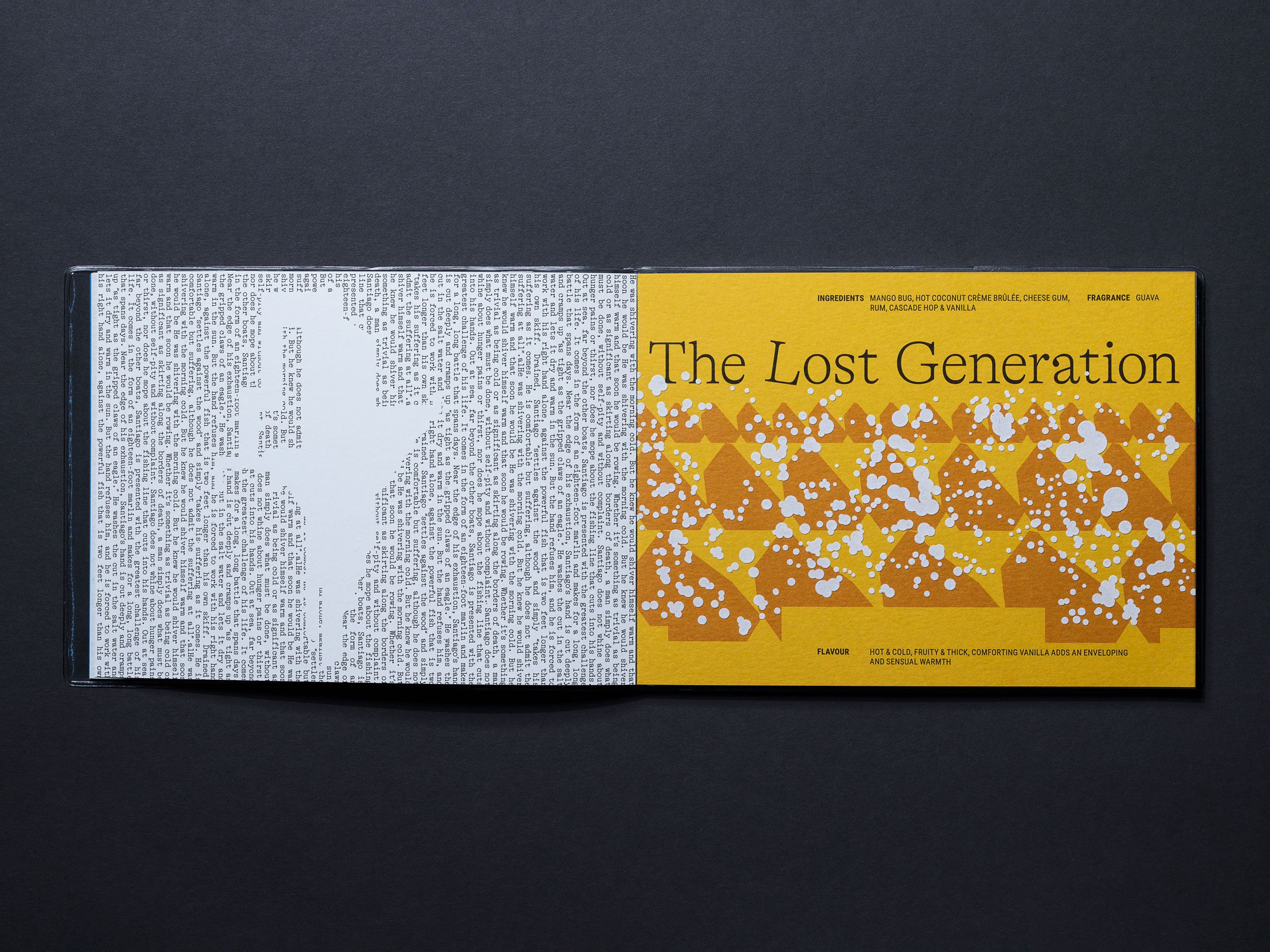
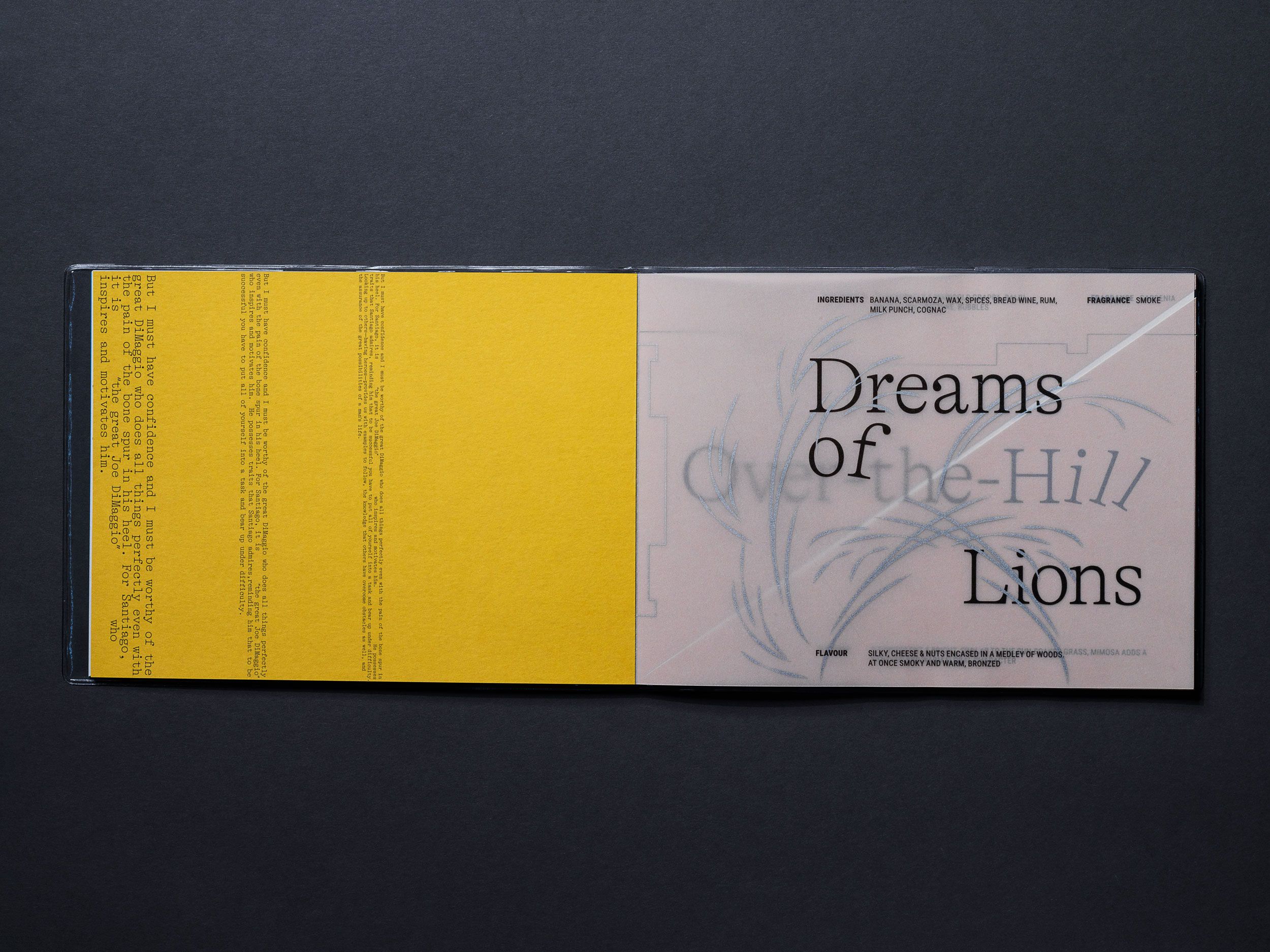
Over the years The Old Man has gained a cult status on the Hong Kong bar scene. It has grown prominent and successful with the crowd disproportionately of its small, almost intimate size. To keep up the hype .Oddity was called to relaunch its identity for the 4th birthday of the beloved bar.
Needless to mention the story of the studio goes hand in hand with the bar as its menu was one of the very first acclaimed projects we have received multiple recognitions for. Contemplating our years passing by chosen a fine ageing as the core motif of the relaunch. Getting older, getting better.
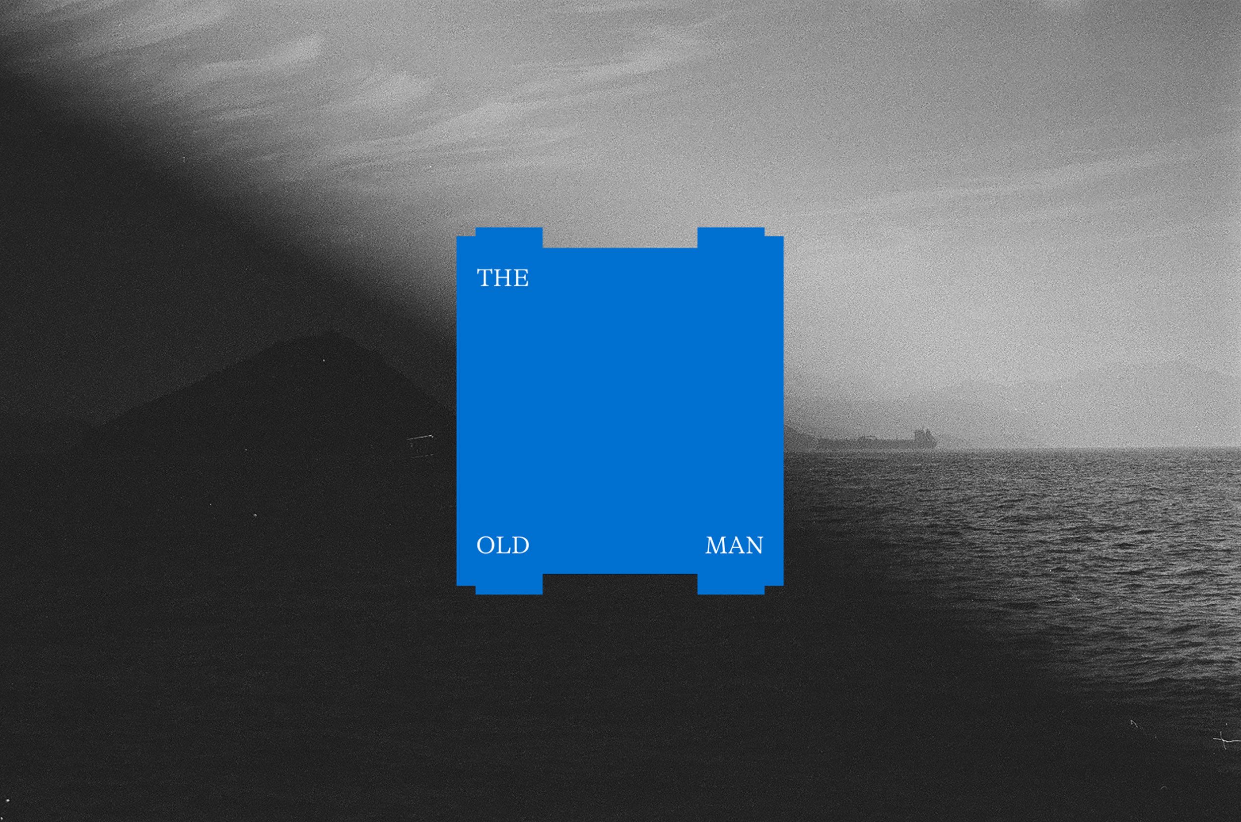
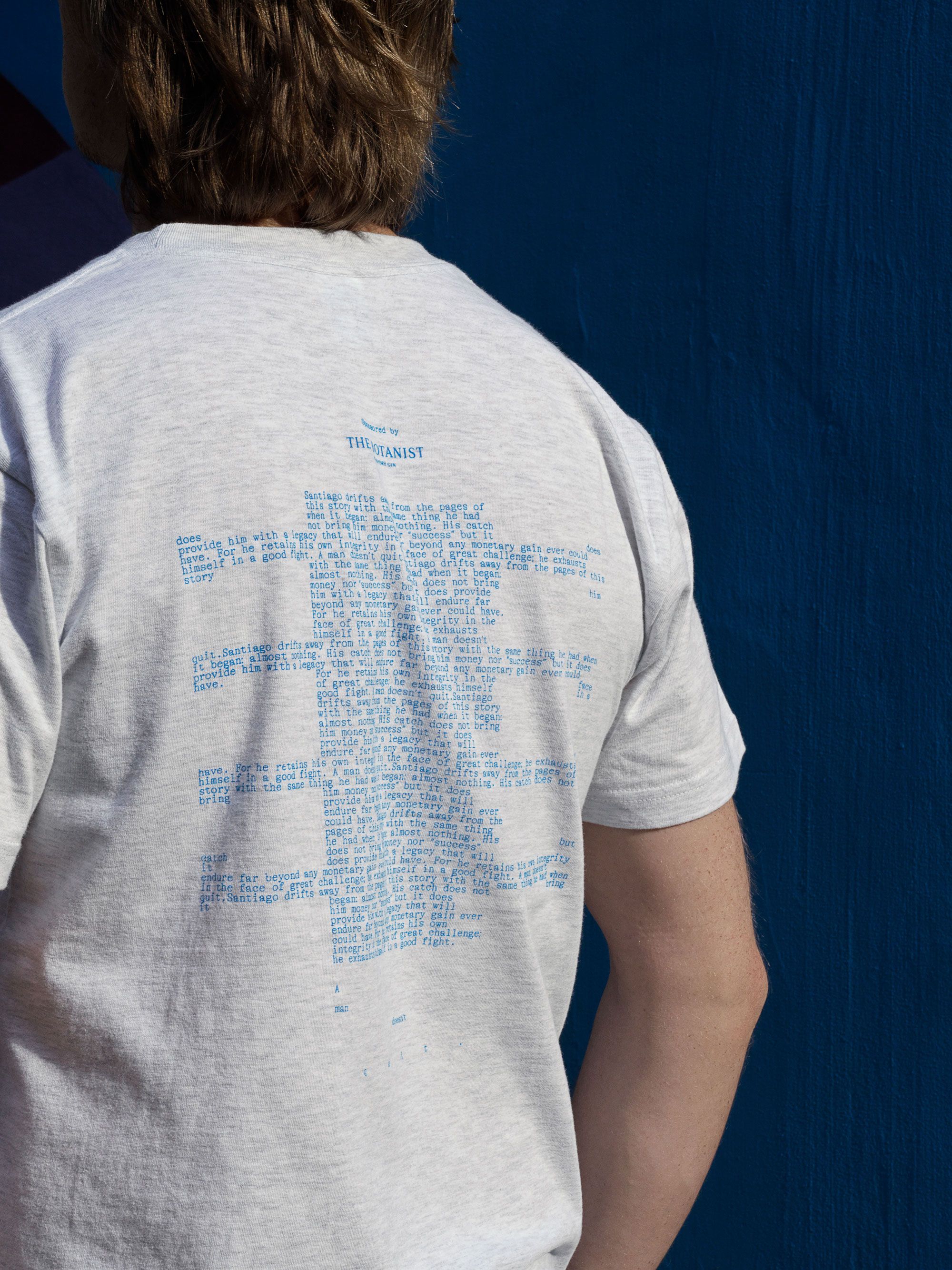
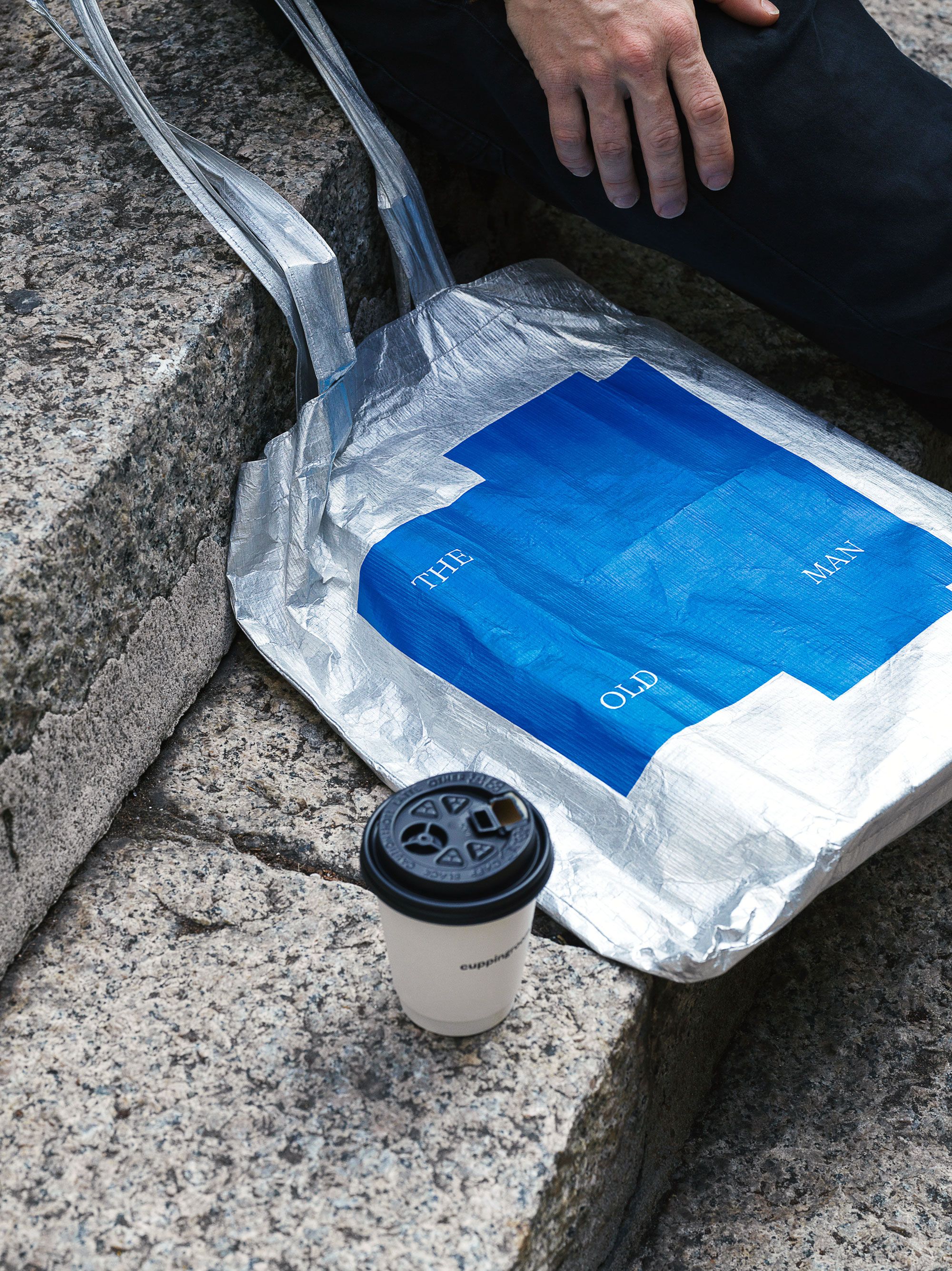
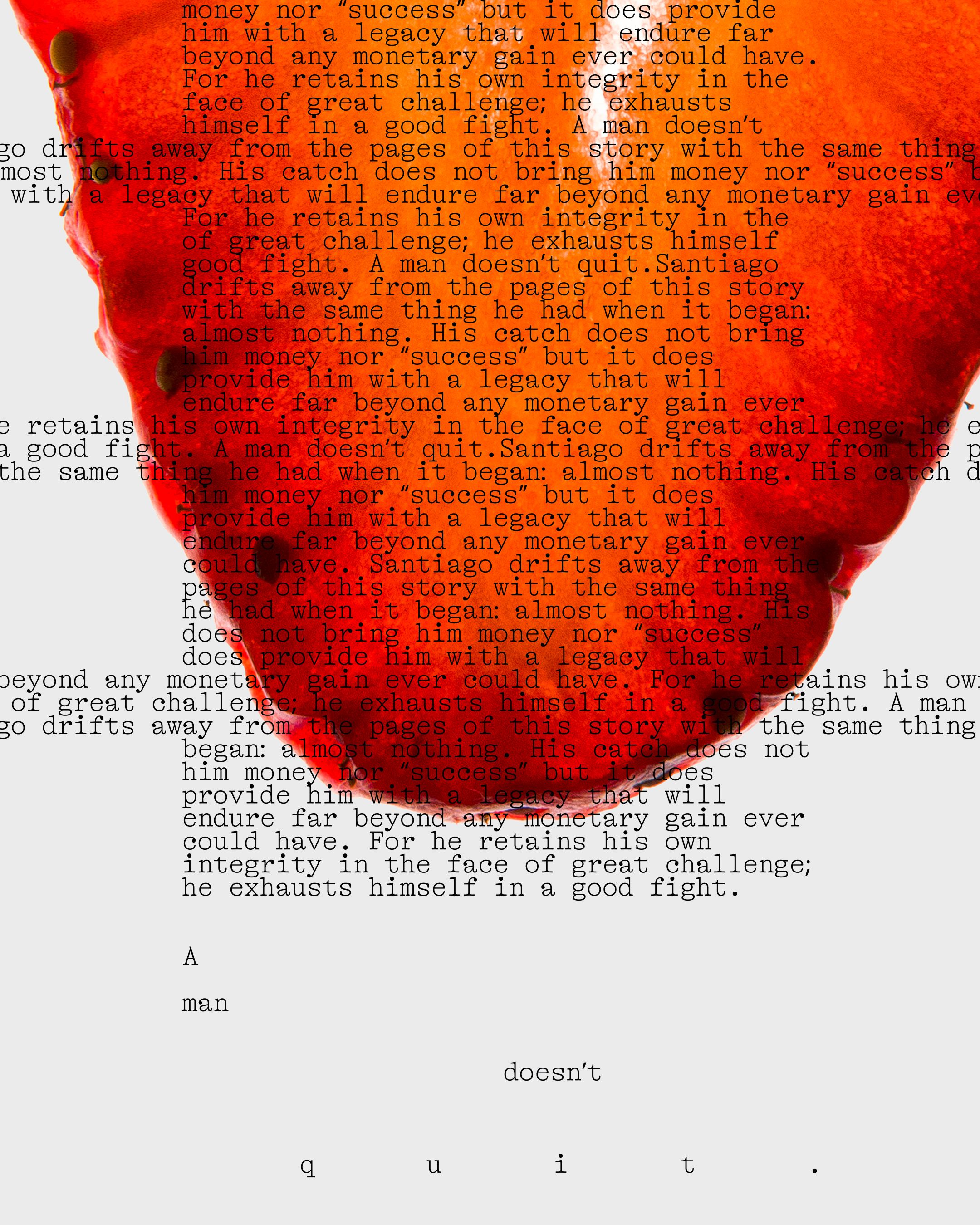
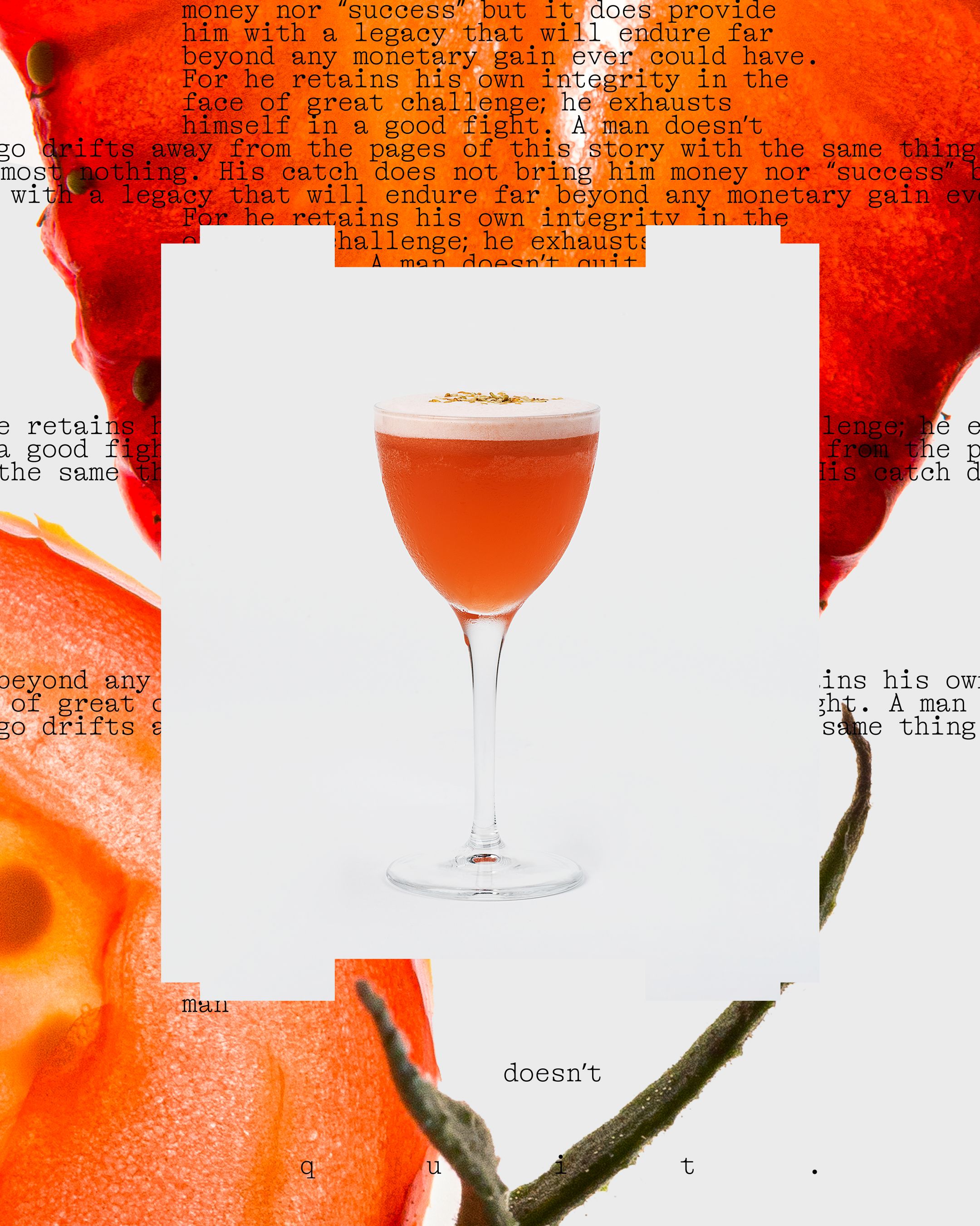
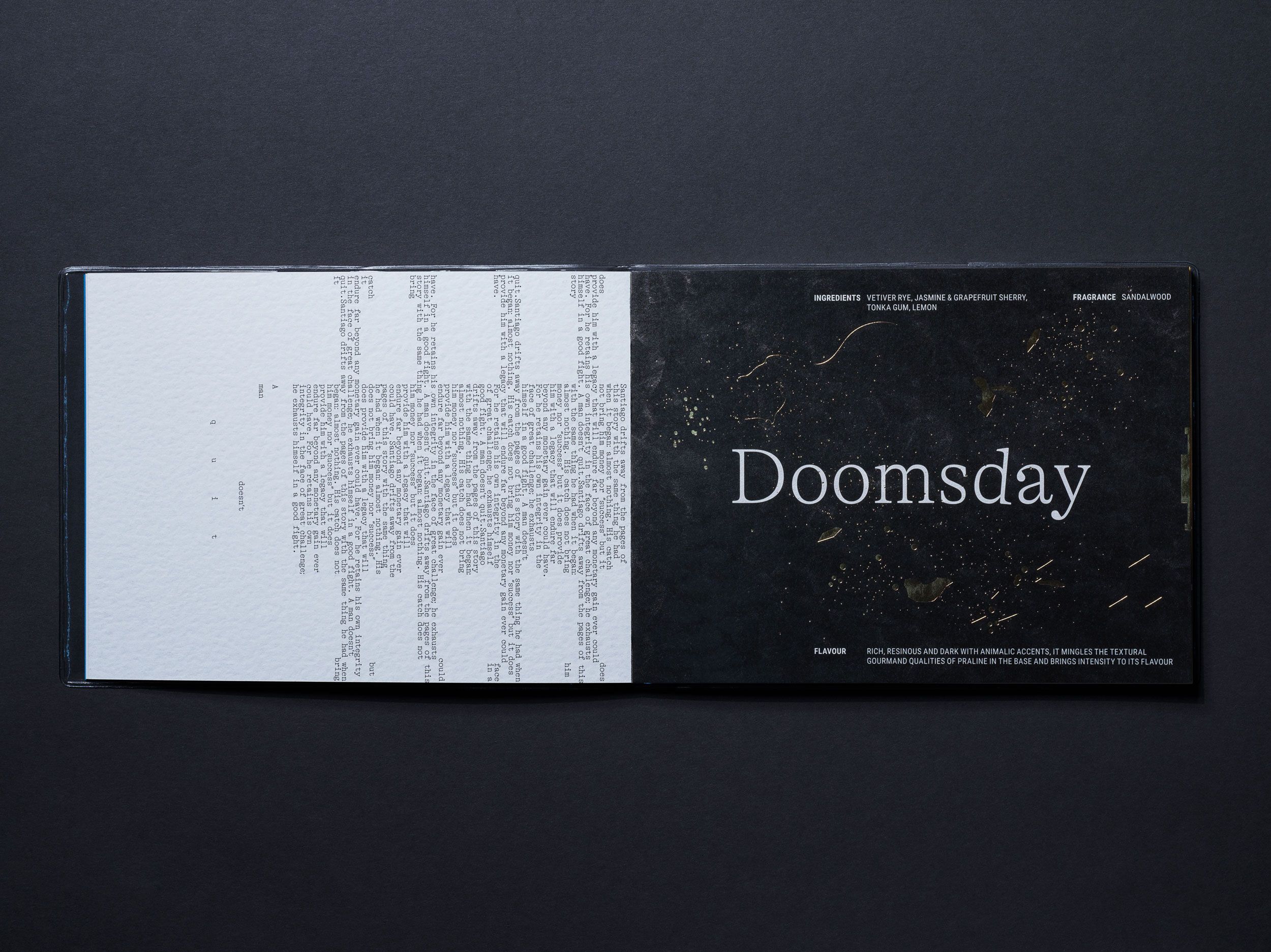
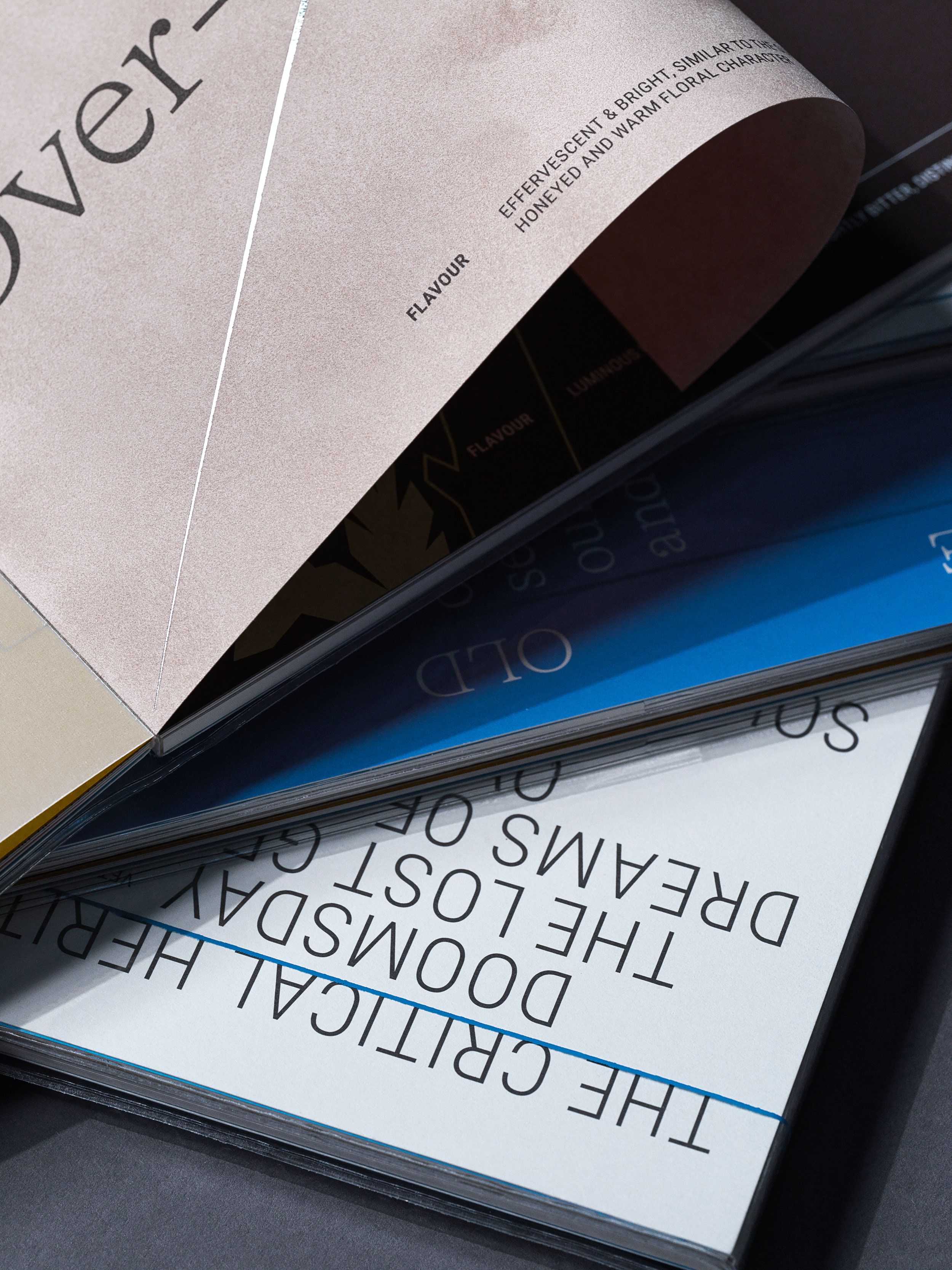
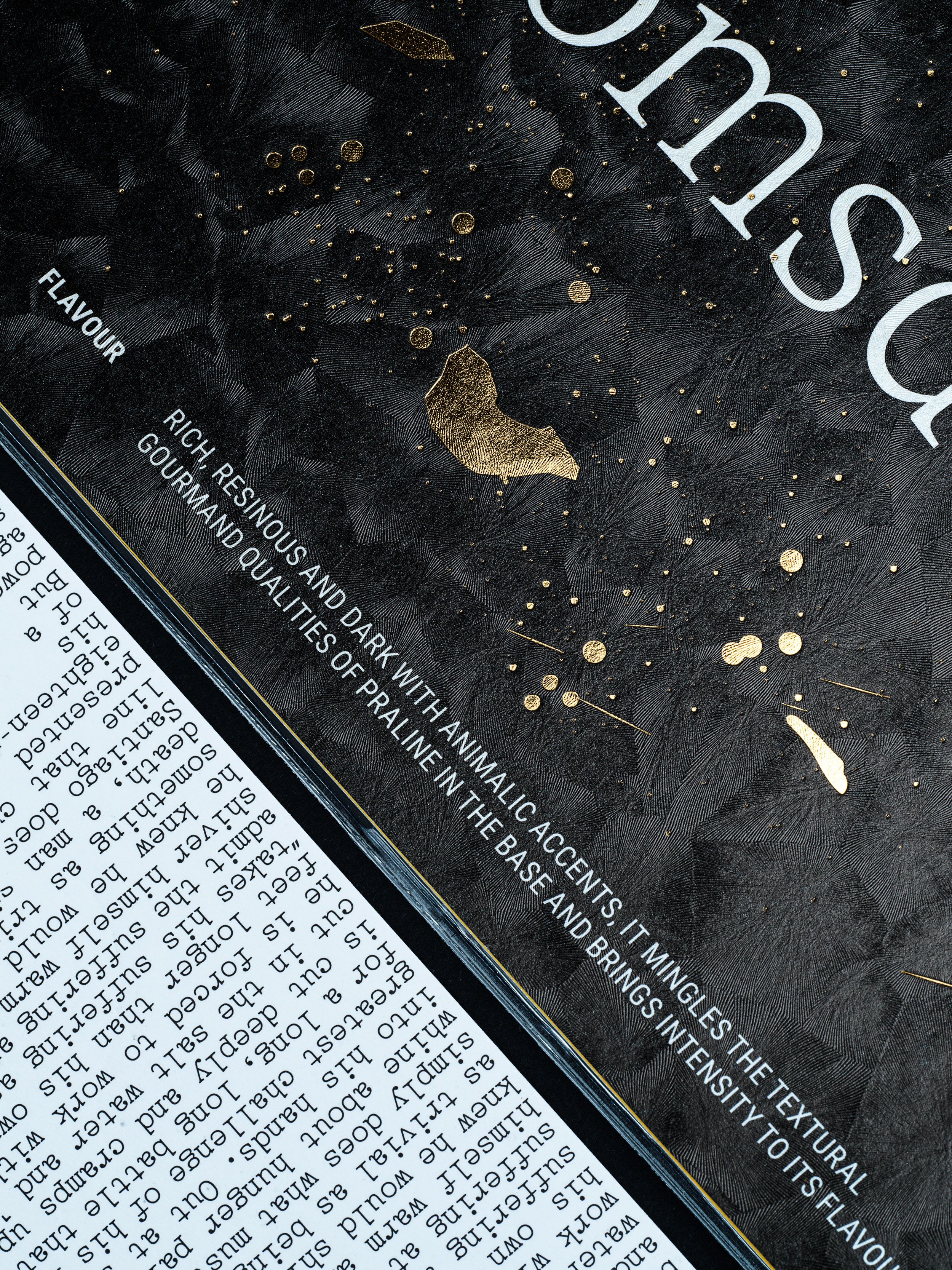
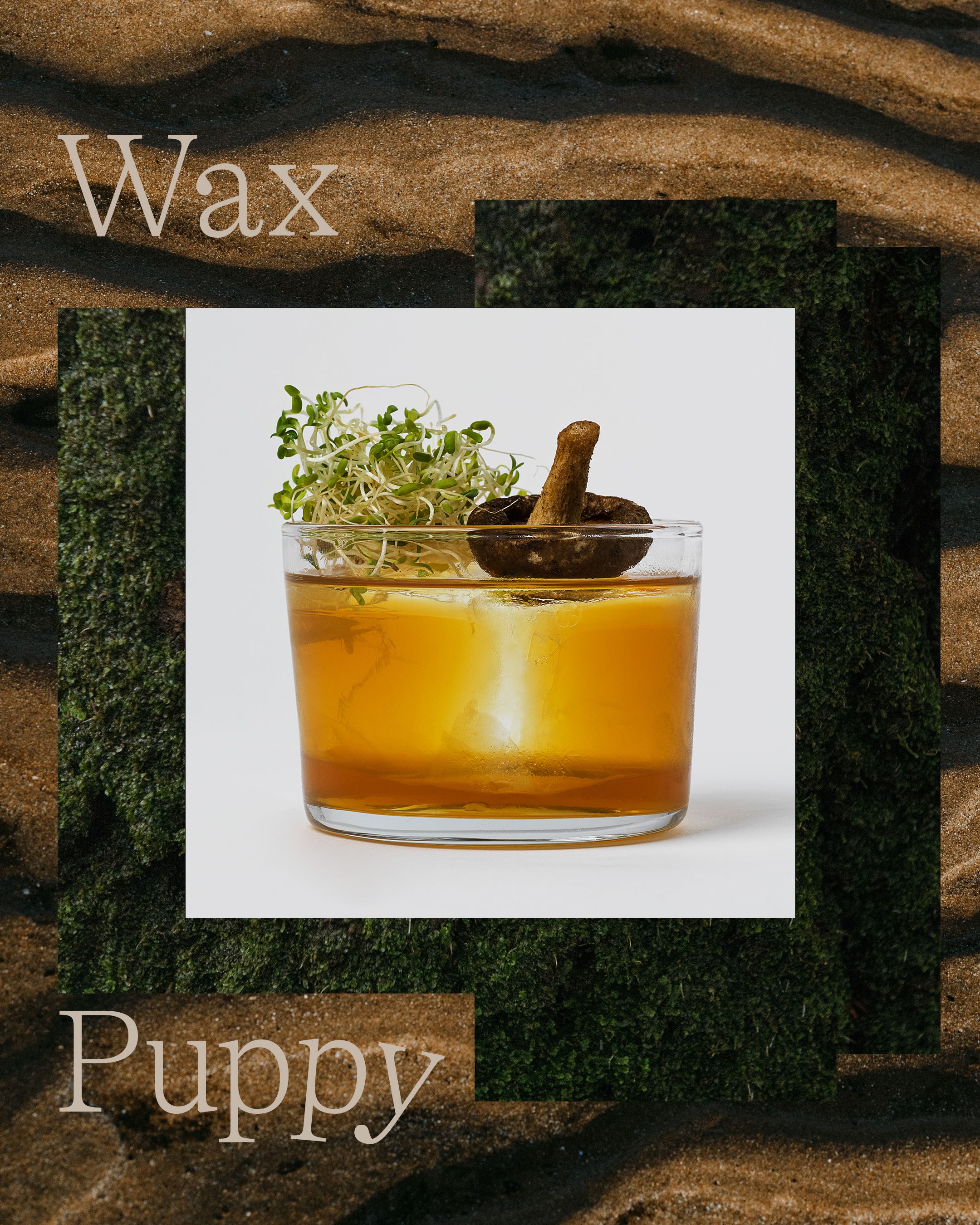
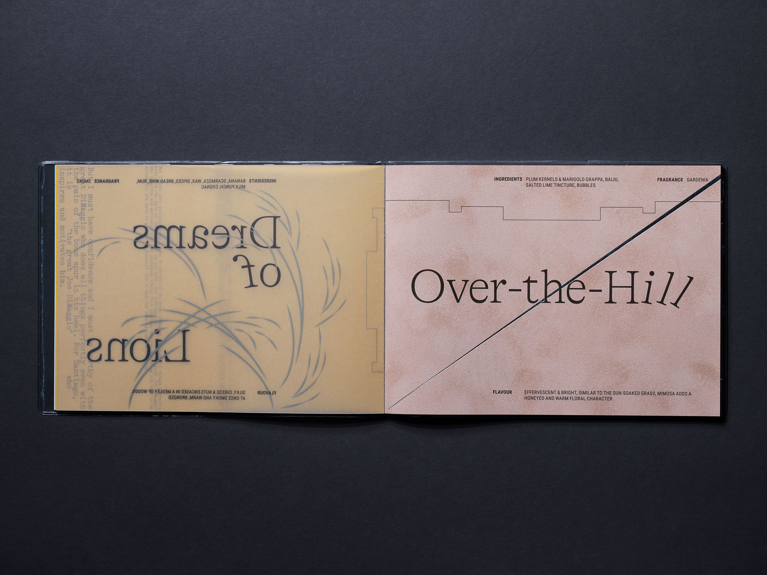
We have developed system of shapes deriving from the iconic logotype evolving its graphical expression further. Same as before, the identity is leaning towards vintage effects, and this time with typewriter typography with exaggerated tilts of glyphs strengthening ageing motif while telling the favourite stories of Hemingway. It is self ironic and quite metaphorical at the same time.
Featured on:


Typeface:
Think we’d be a great fit for your brief?
Drop us a line to [email protected]