
cupping room
Functional design
0
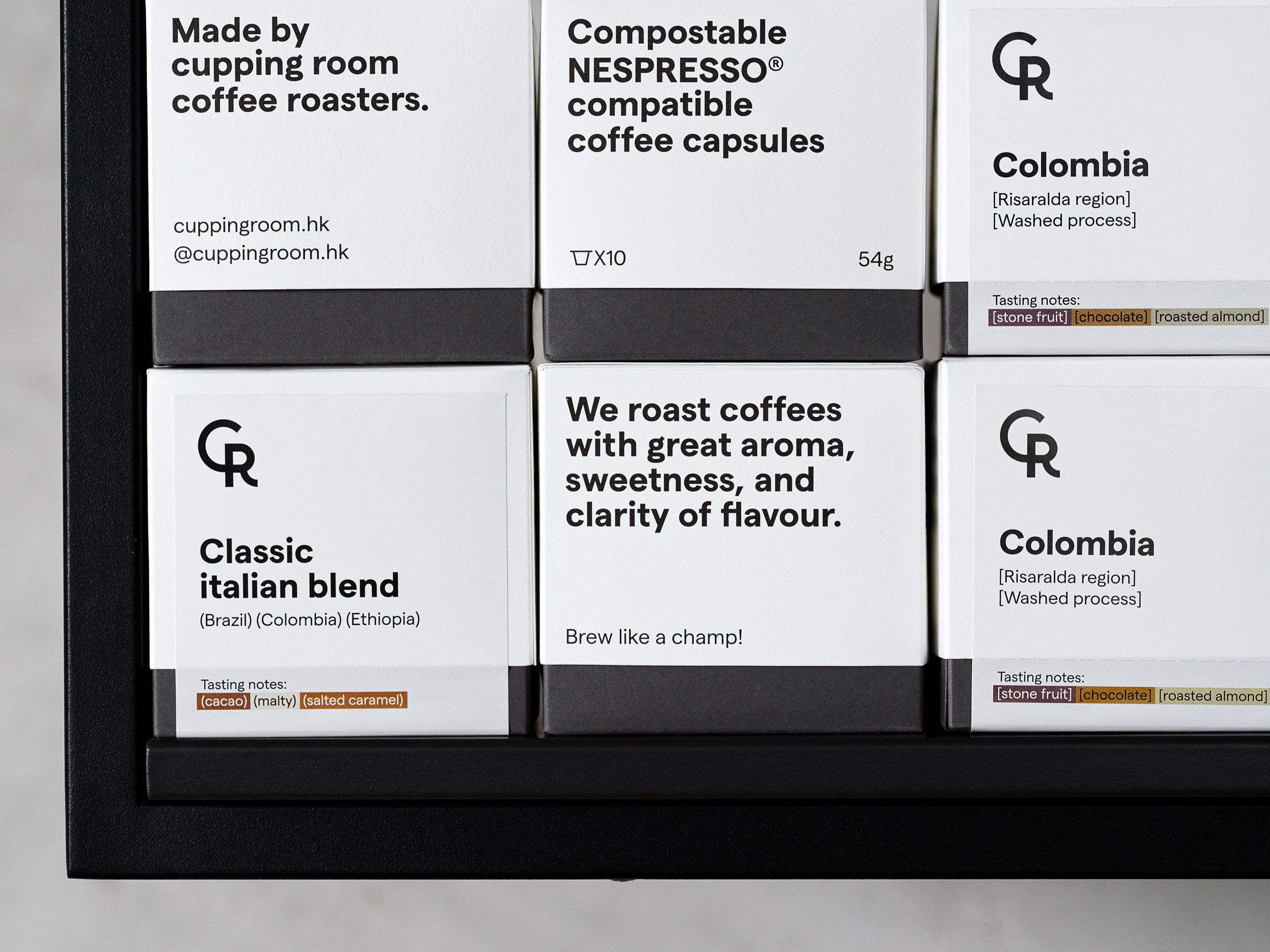
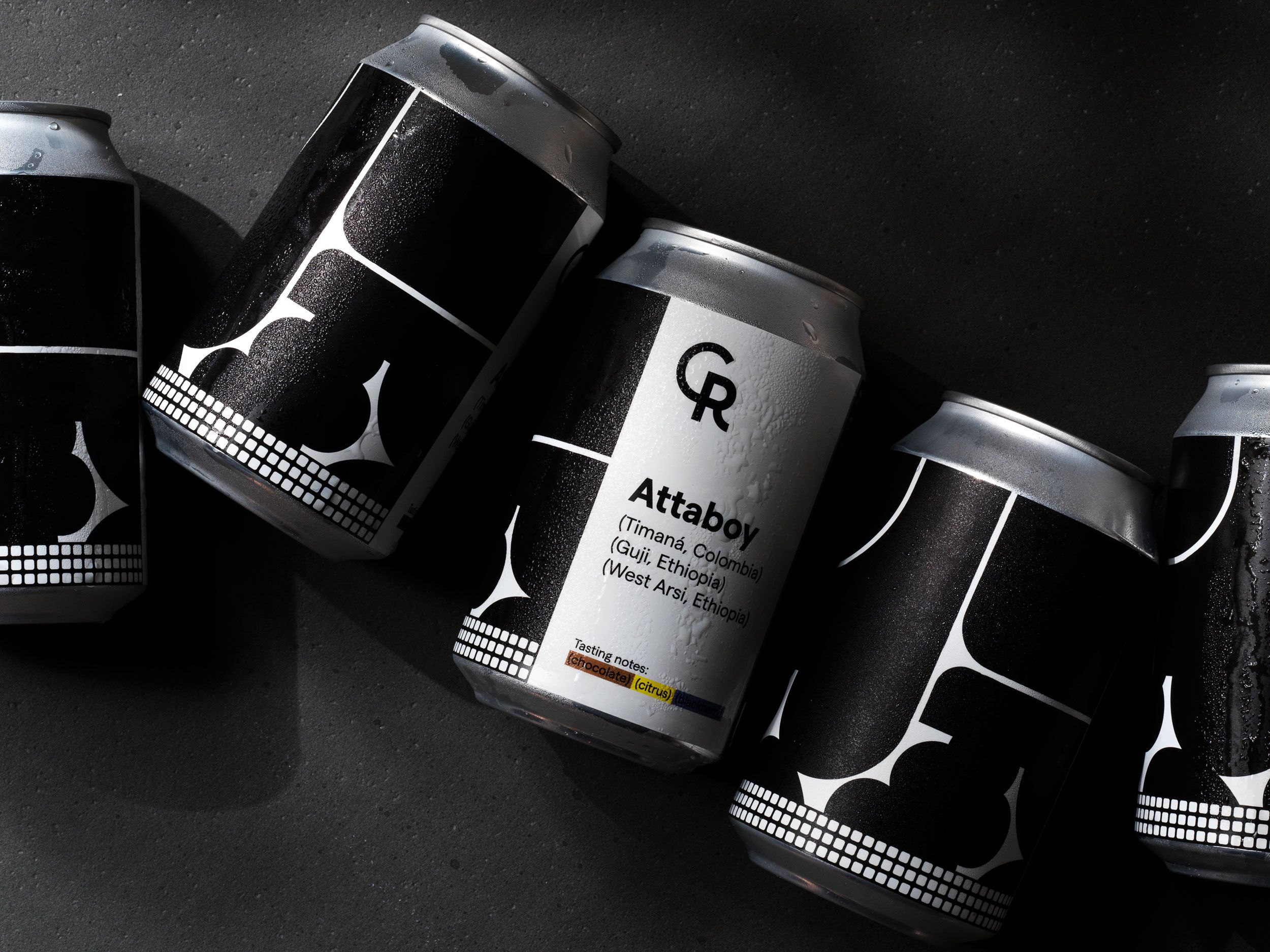
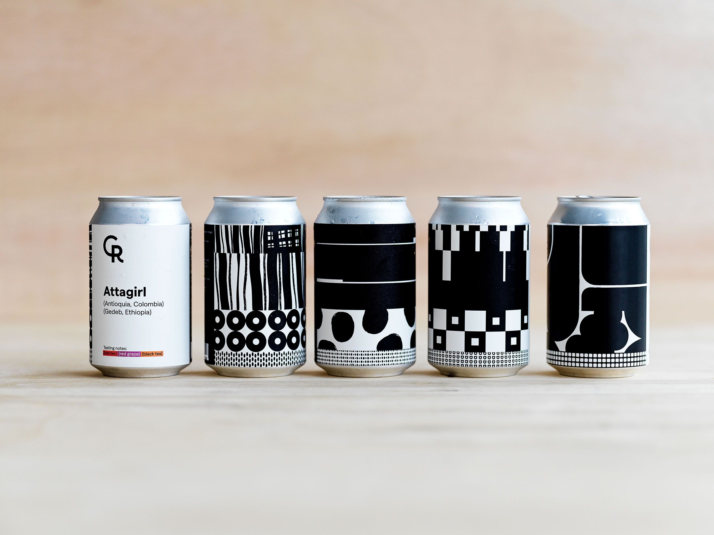
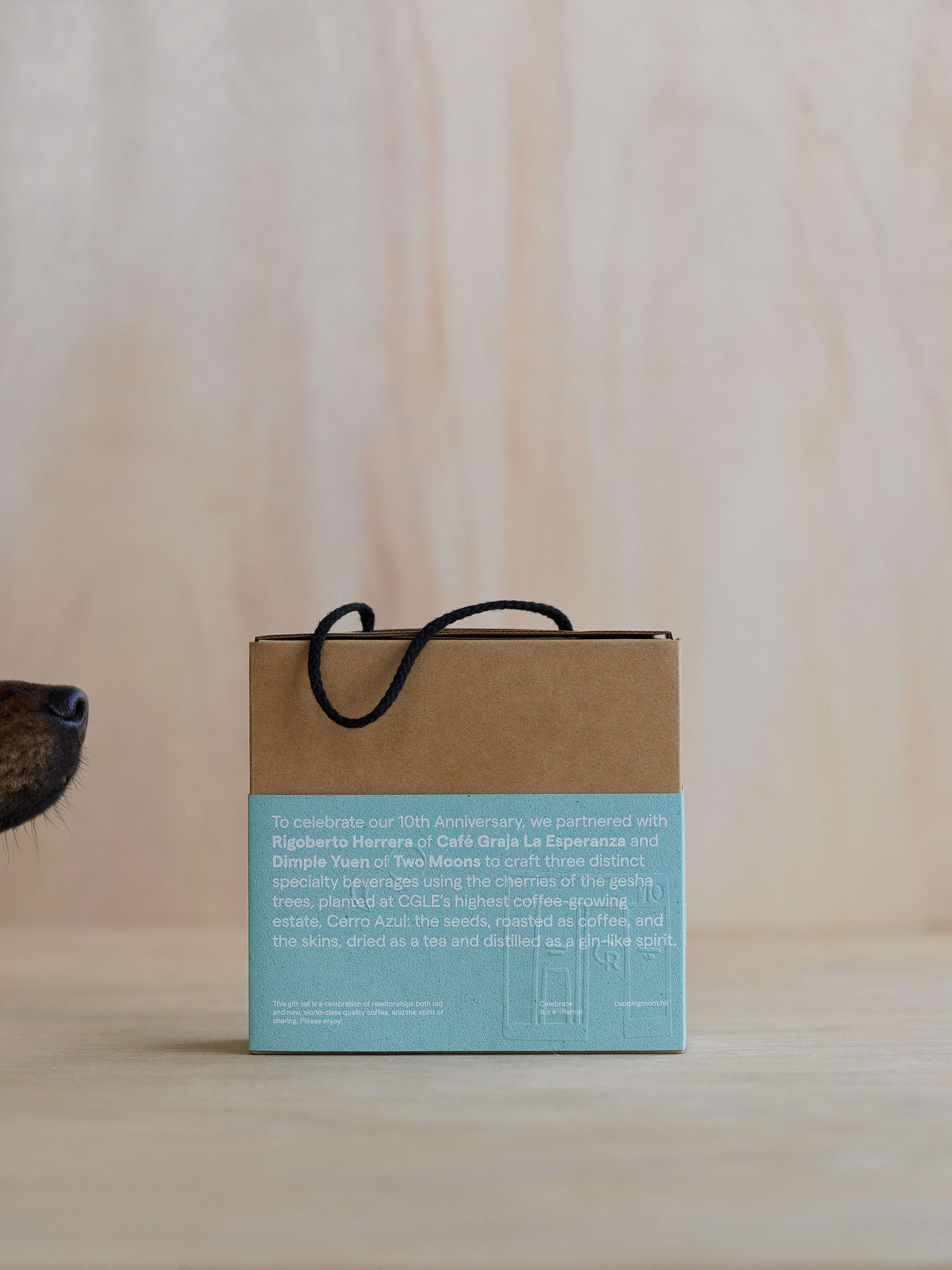
The beauty of cupping room identity is in its simple and functional structure. From full image to small details our concept goes in line with the brand philosophy that oversees quality of coffee starting from relationships with coffee growing estates and up to a perfect cup served at the shop. Every smallest detail in the supply chain matters!
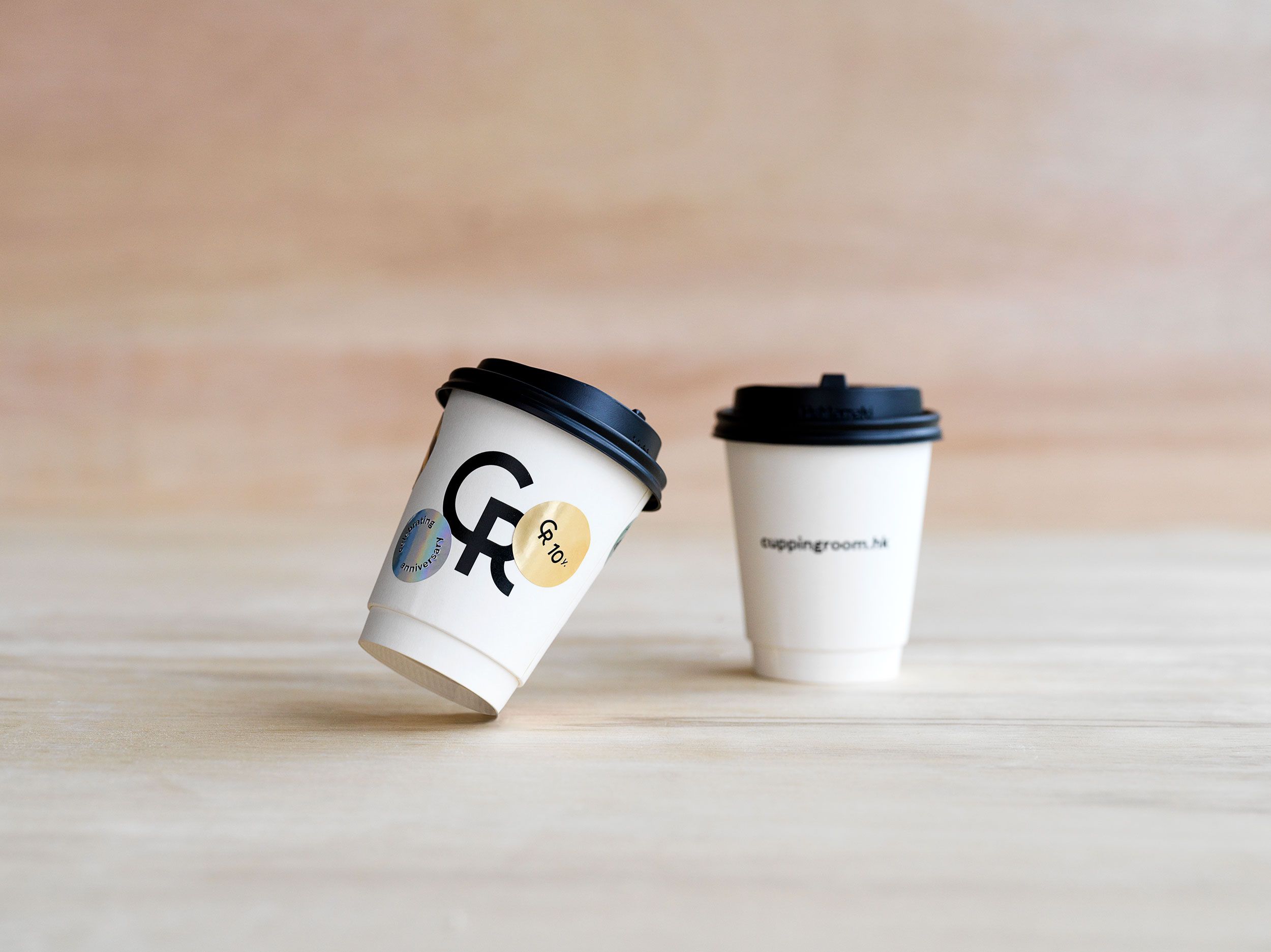
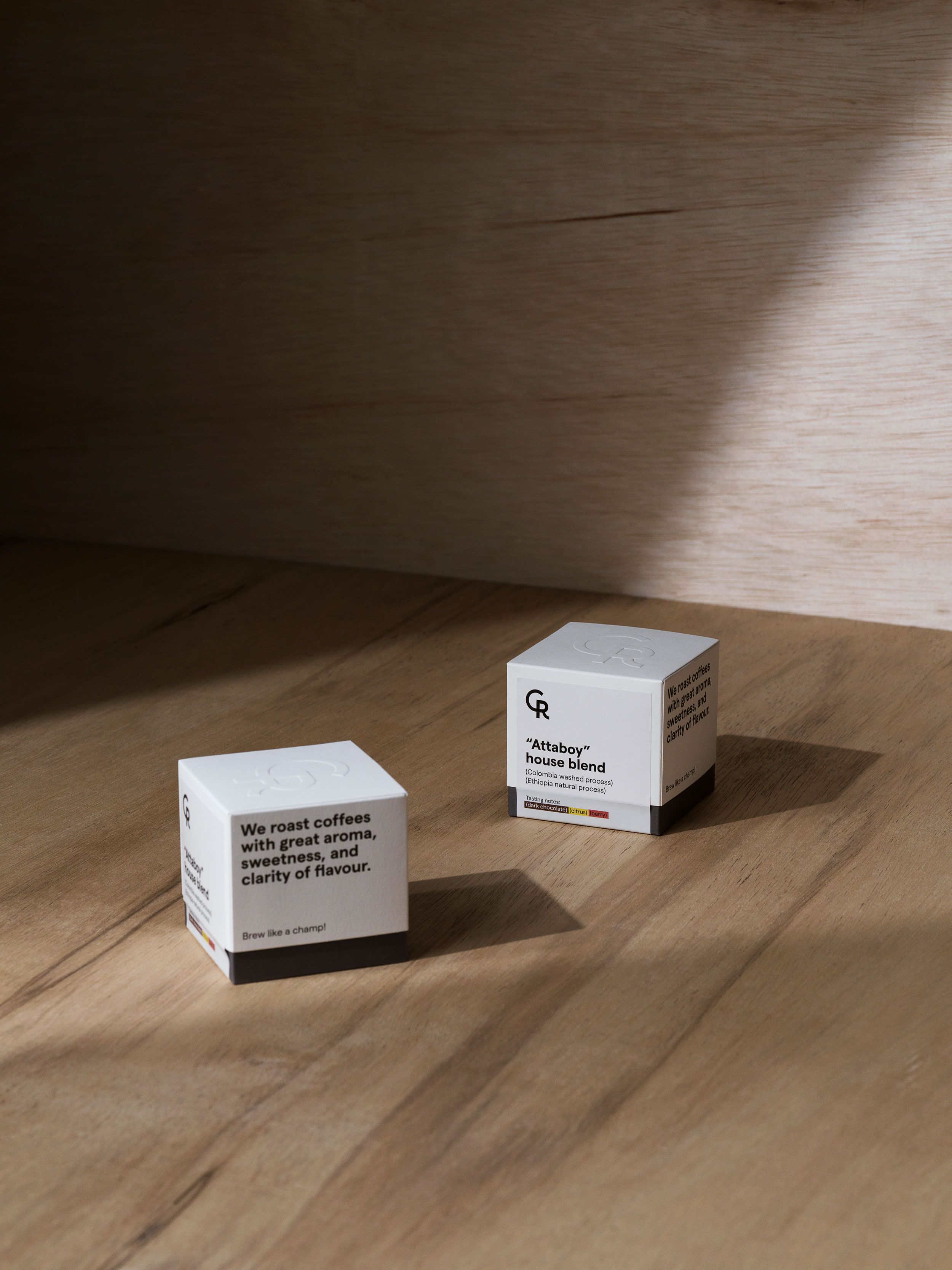
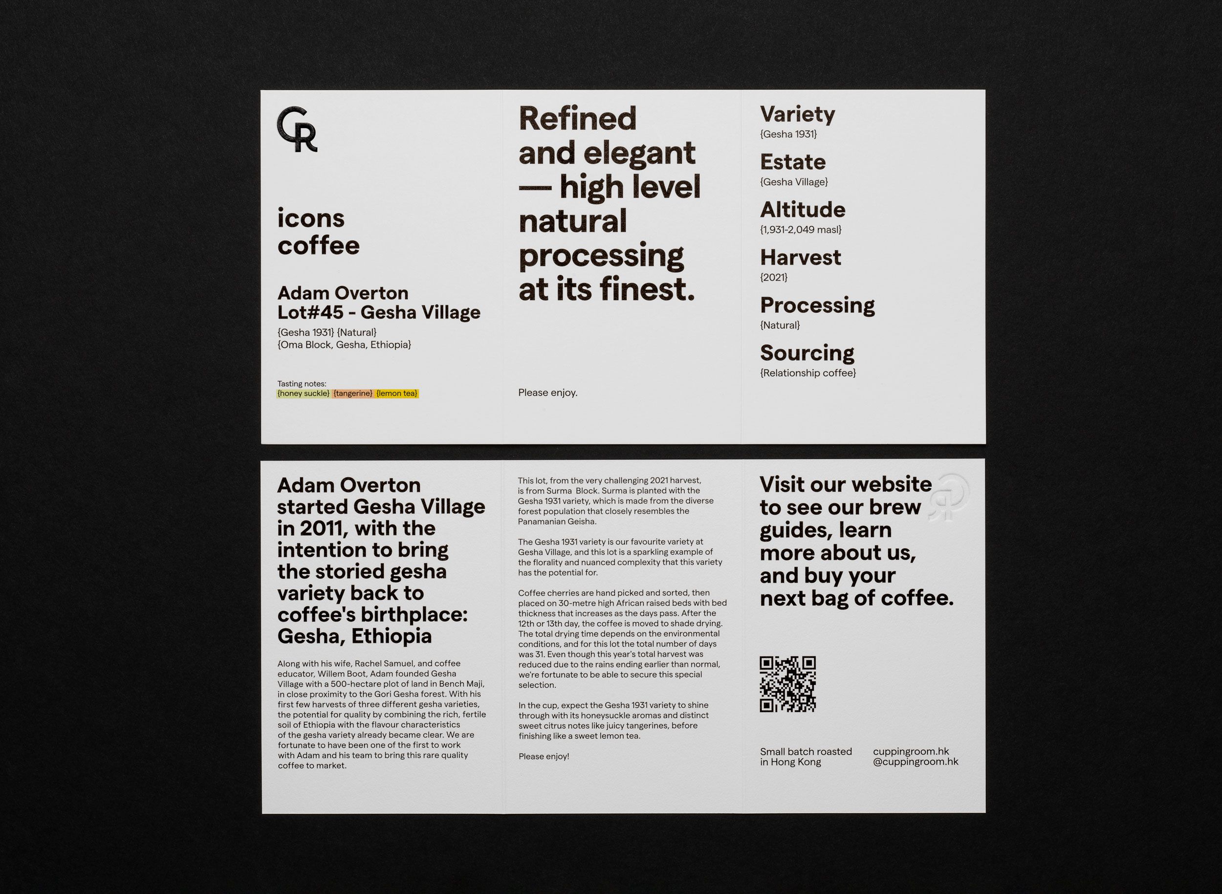
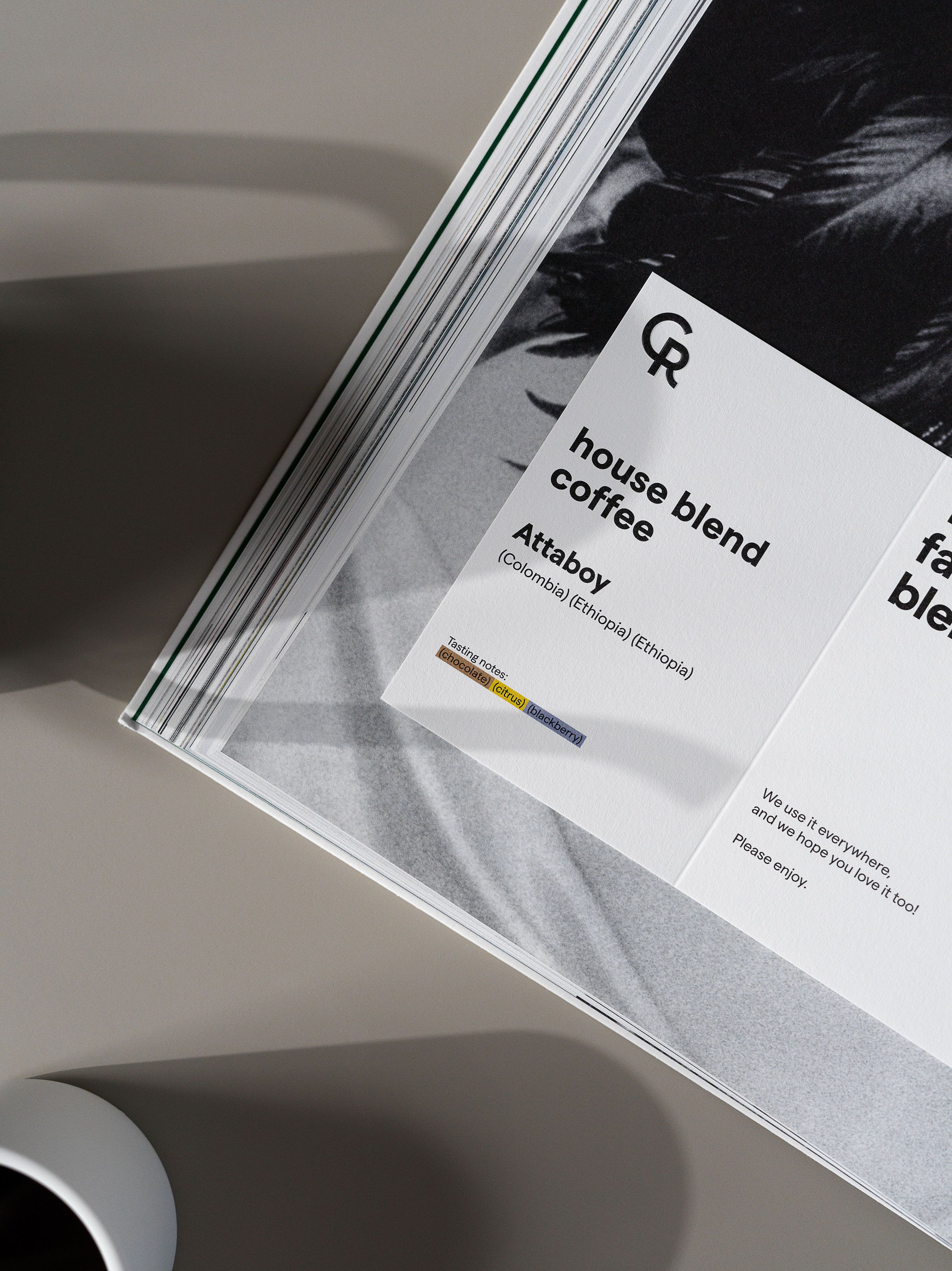
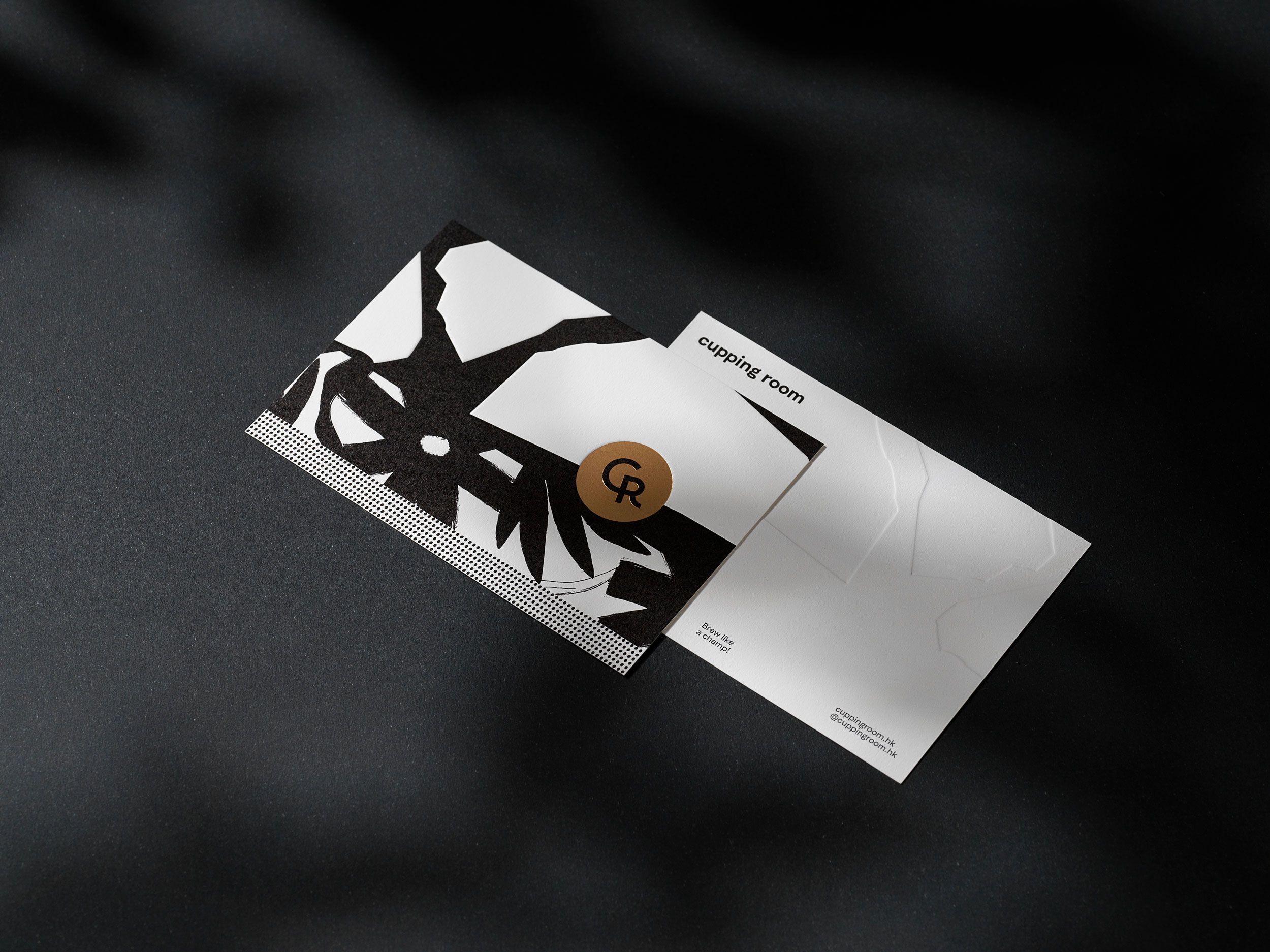
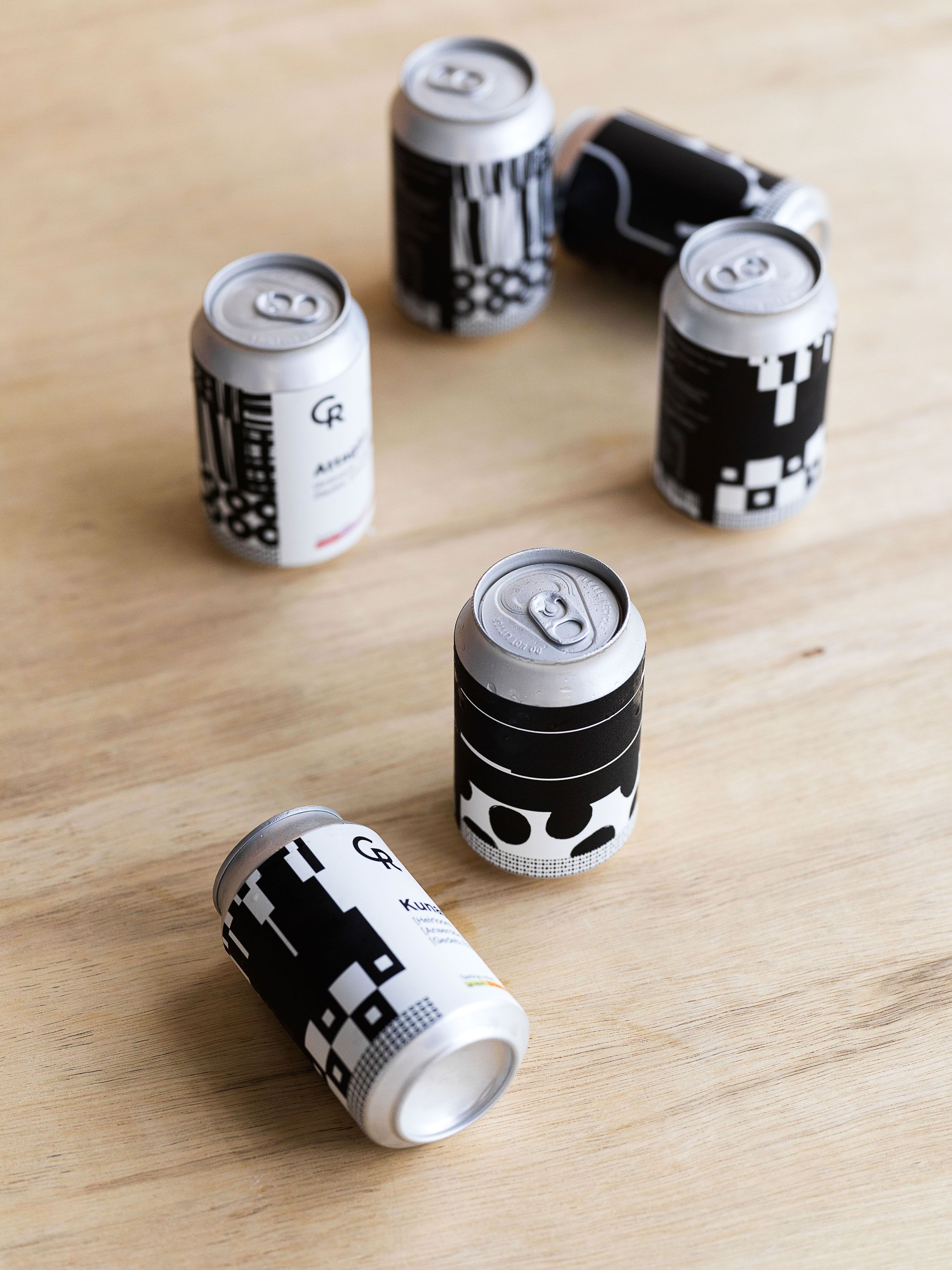
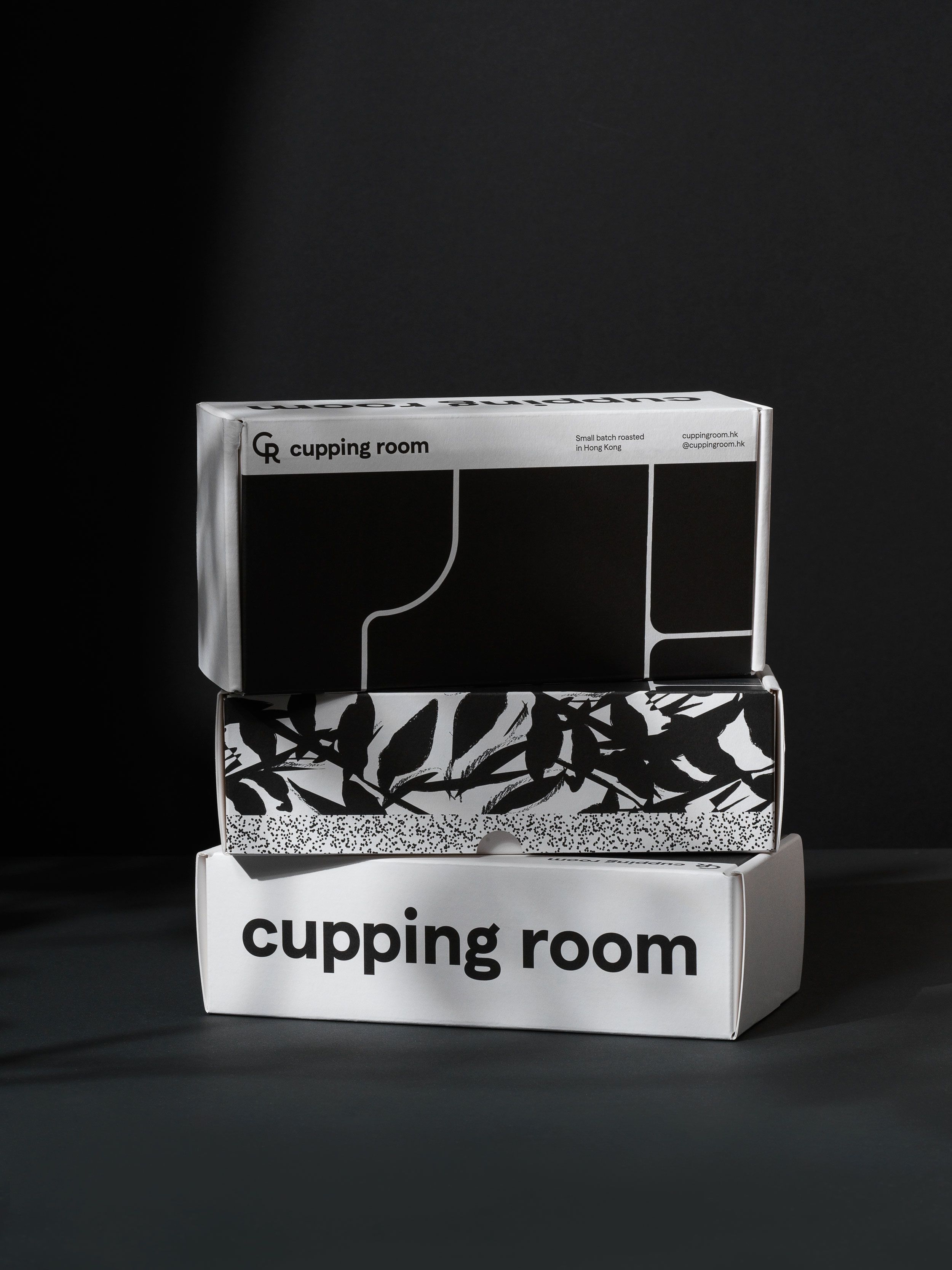
Our practical system reflects cupping room vision with typographic hierarchy from big and bold titles to small footnotes. In combination with grids of identical structure we create a visual language that is easy to follow and remember. Our system offers simple language for the brand to talk about coffee proudly to a wider audience going deep in details for enthusiastic pros and coffee nerds all at the same time. We have further strengthened the identity with contrasting colourful labels and stickers for Cupping room to adapt to occasional happenings like celebrations, special coffee roasts or collaborations in playful way which does not require much changes on the production line.
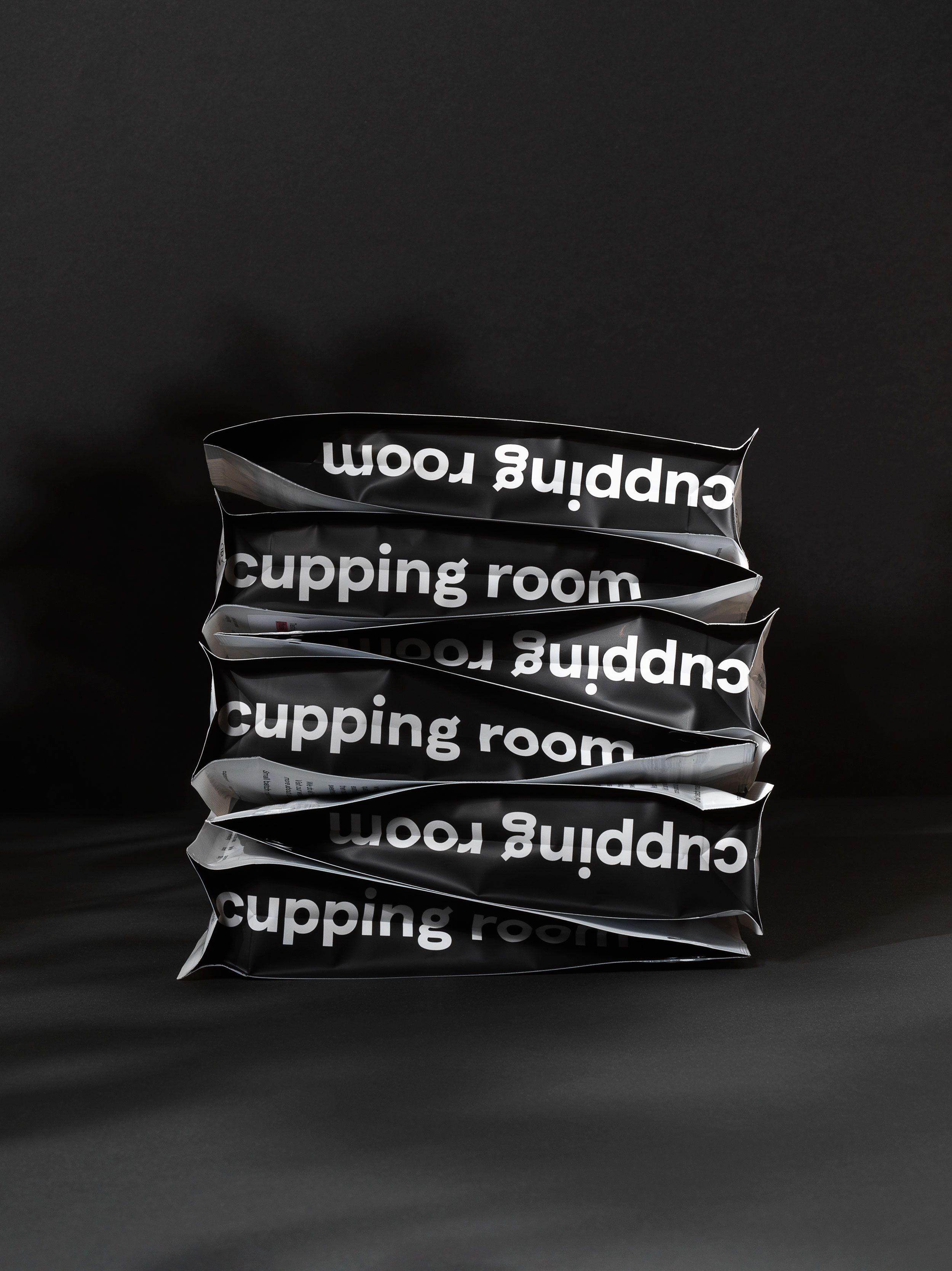
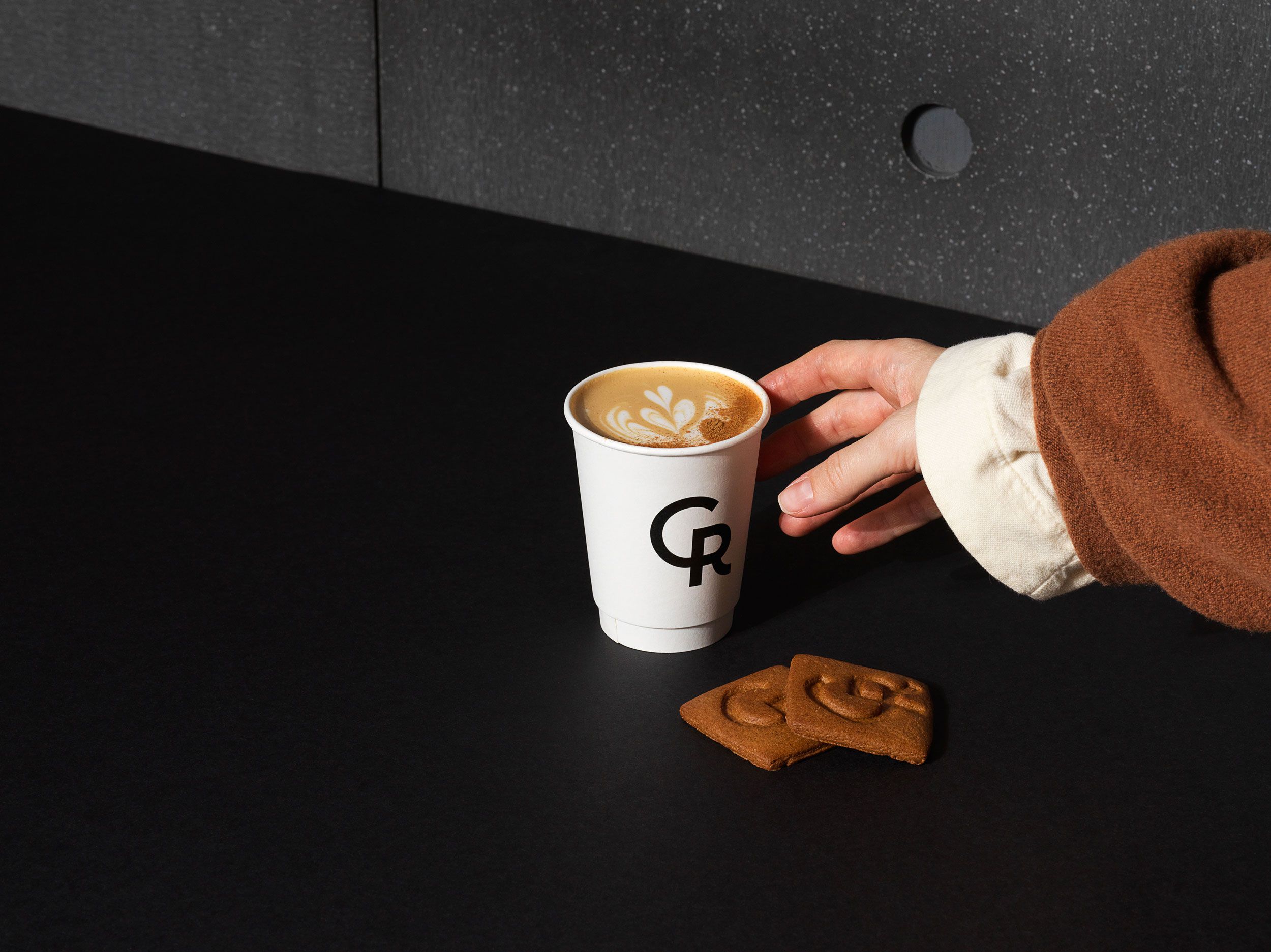
Monotone photography reflects the ascetic interior of cupping room coffee shops, where concrete, light wood and stainless metals dominate. Our typeface of choice is a softer family with rounded characteristics Matter by Displaay. It makes space for comfort and pays homage to the original logotype of the brand.

Typeface:
Paper:
Think we’d be a great fit for your brief?
Drop us a line to [email protected]