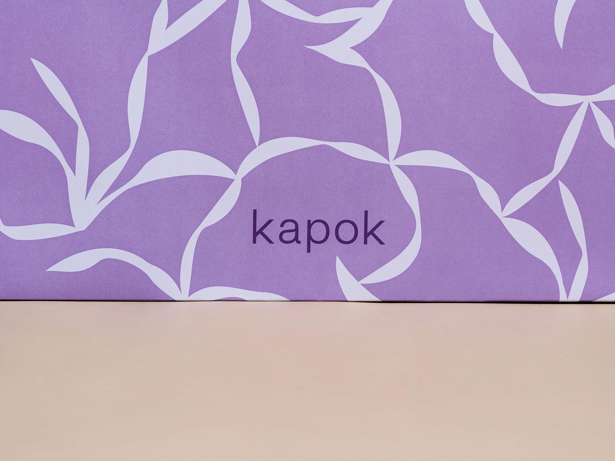
kapok 15th anniversary
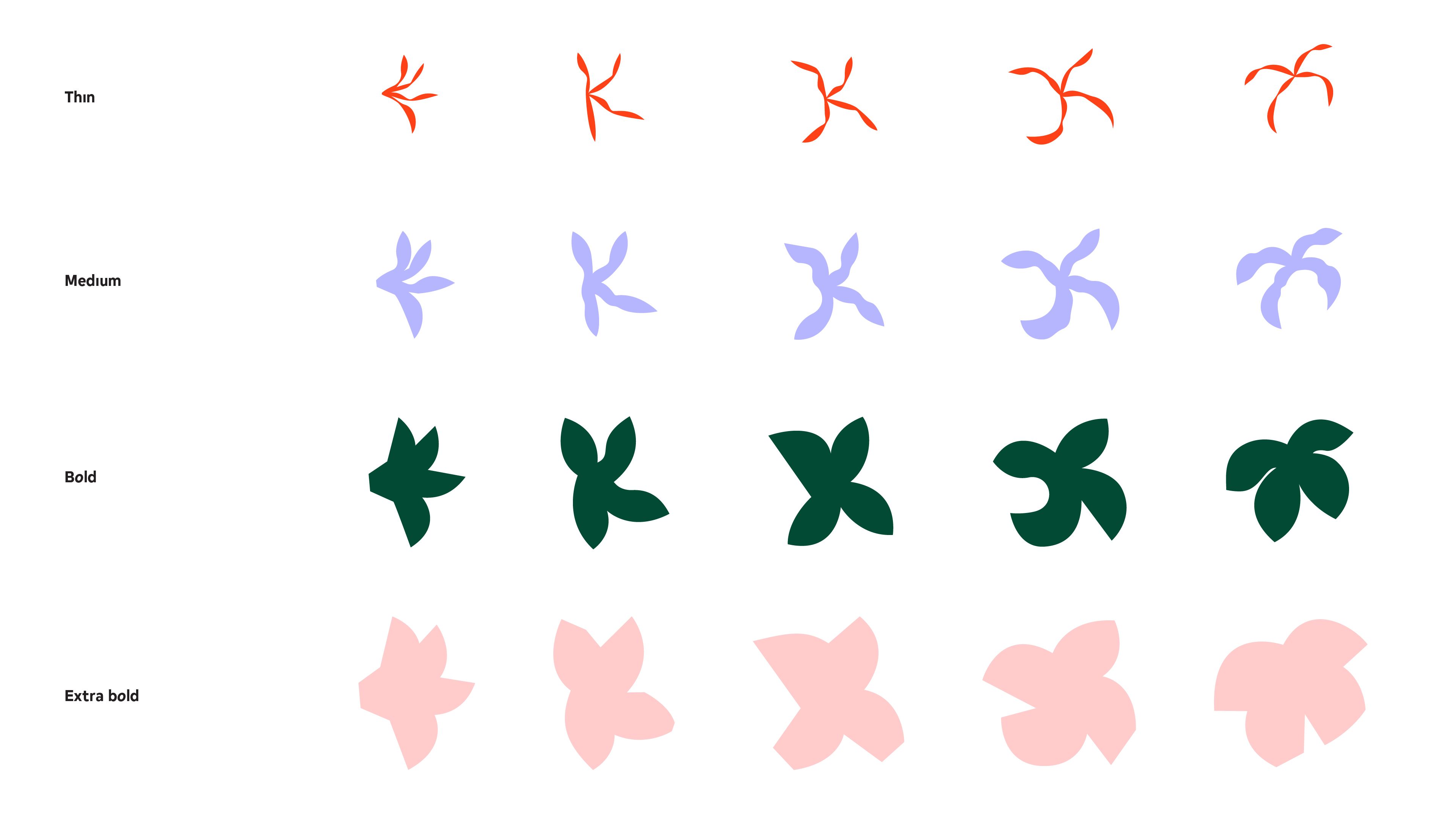
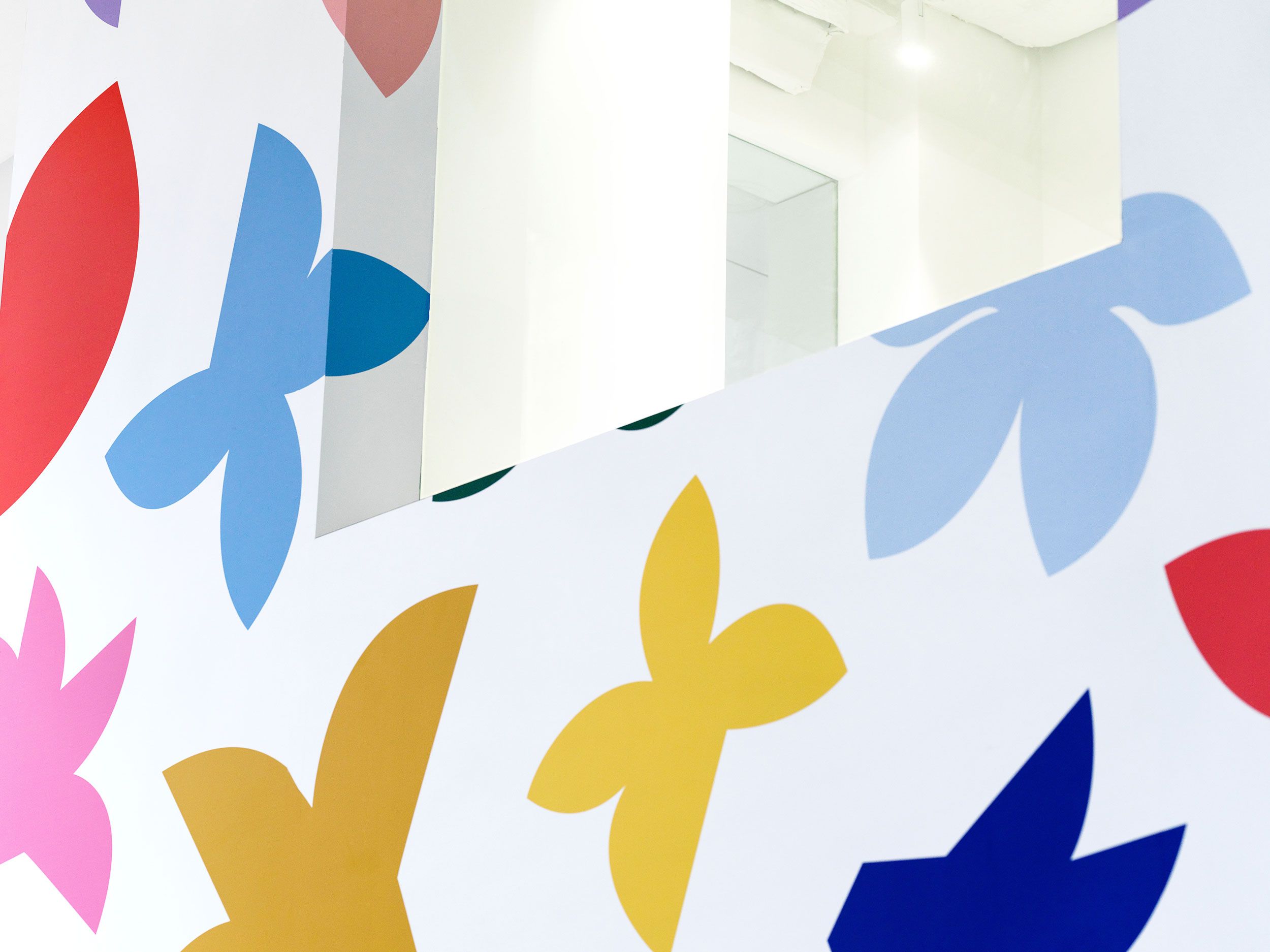
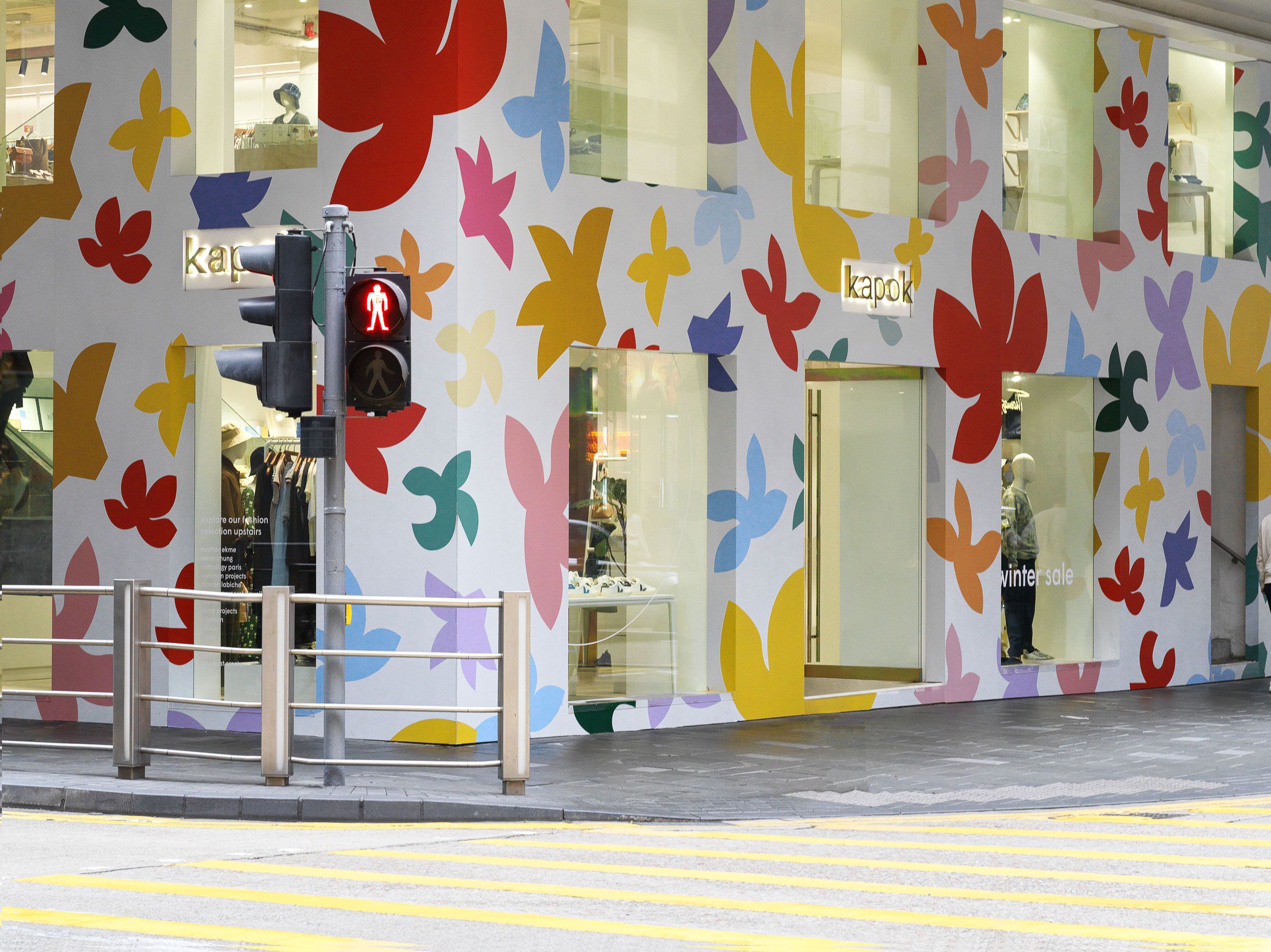
System of flowers
0
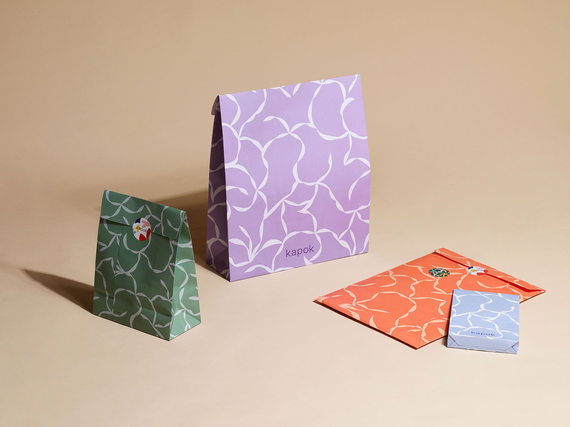
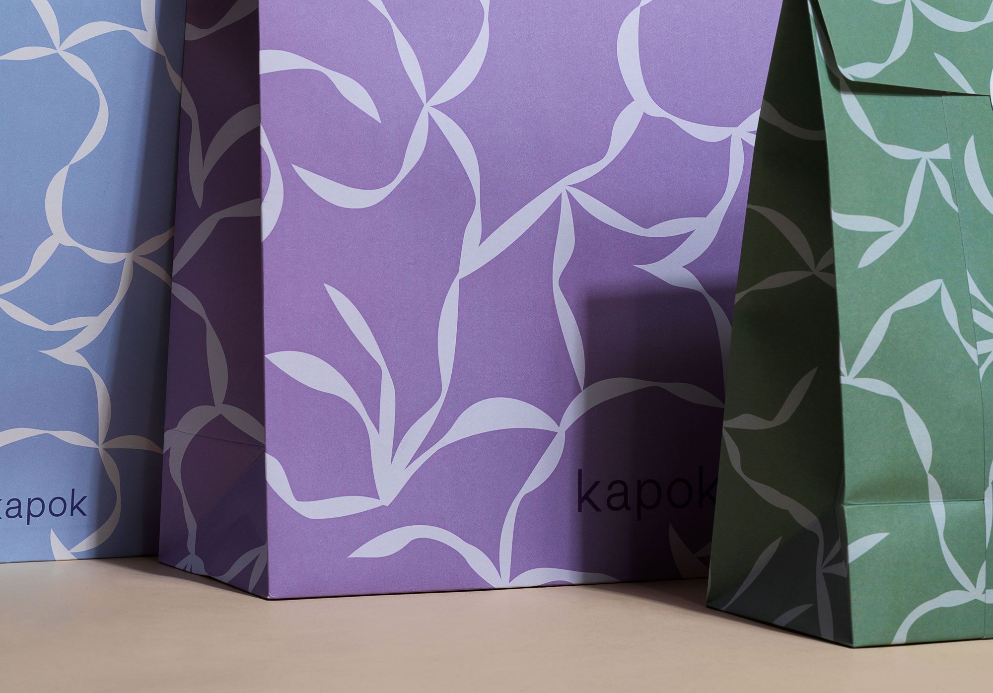
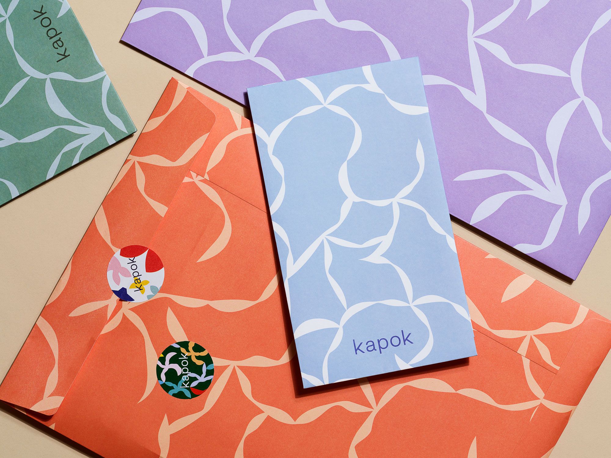
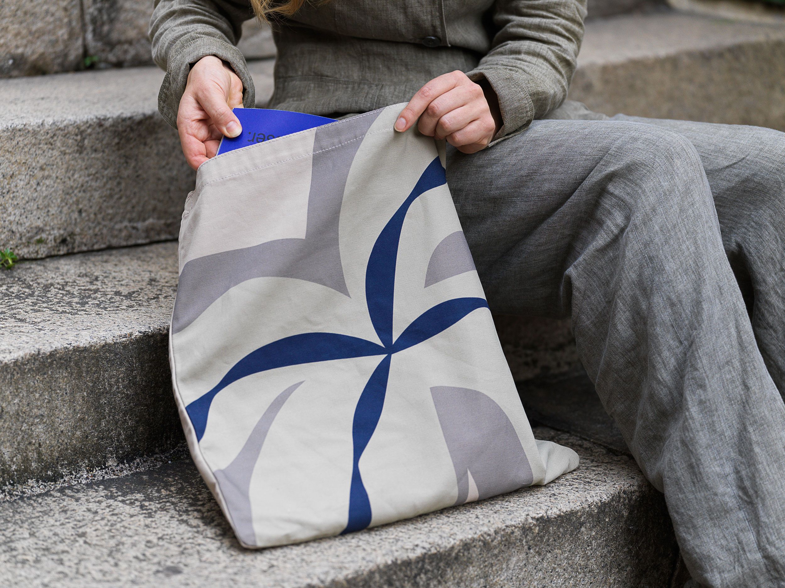
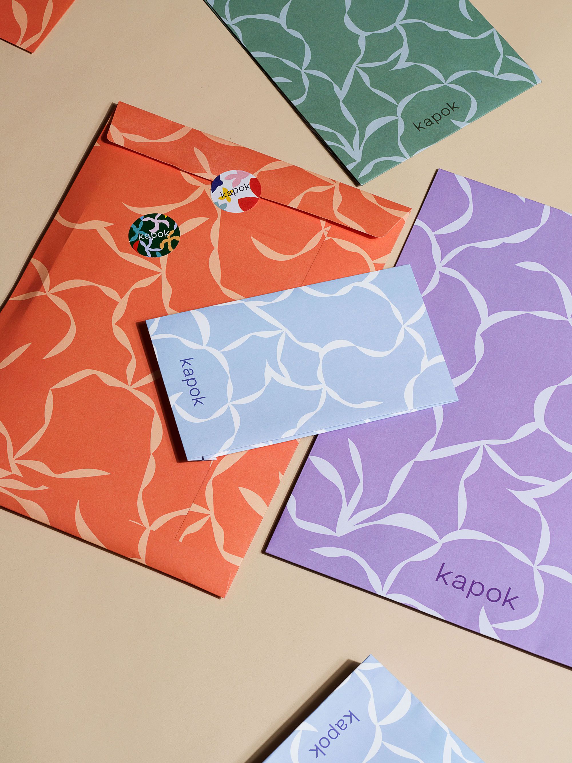
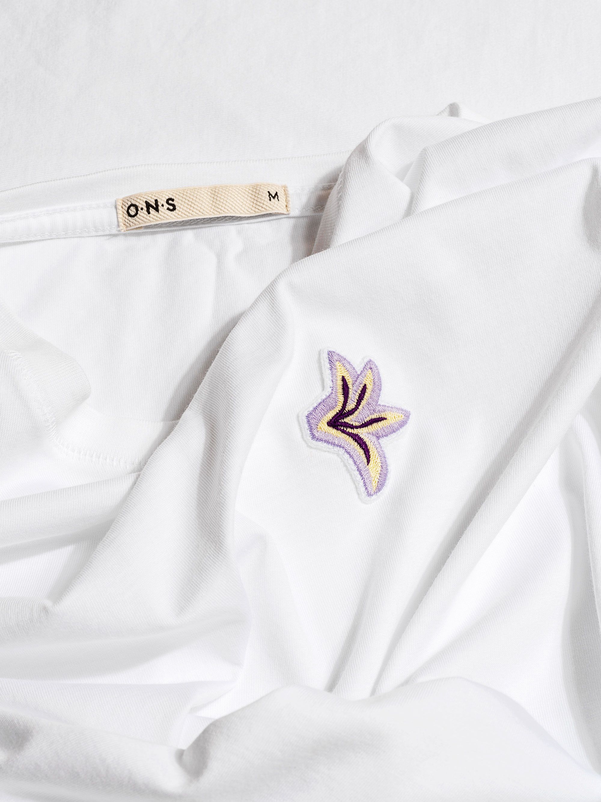
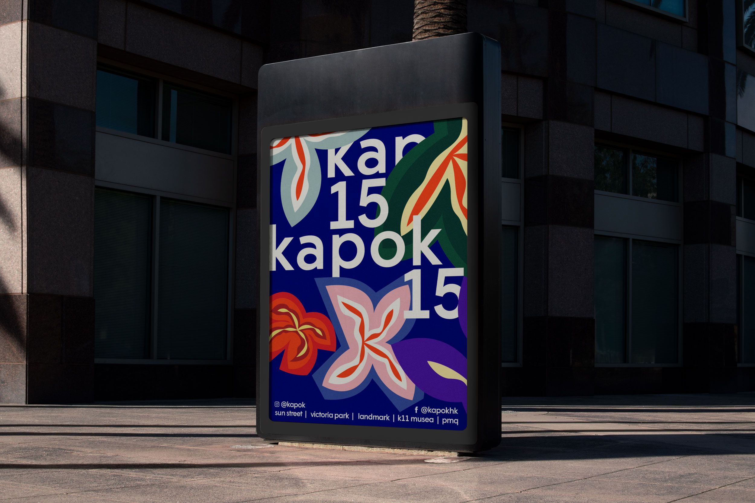
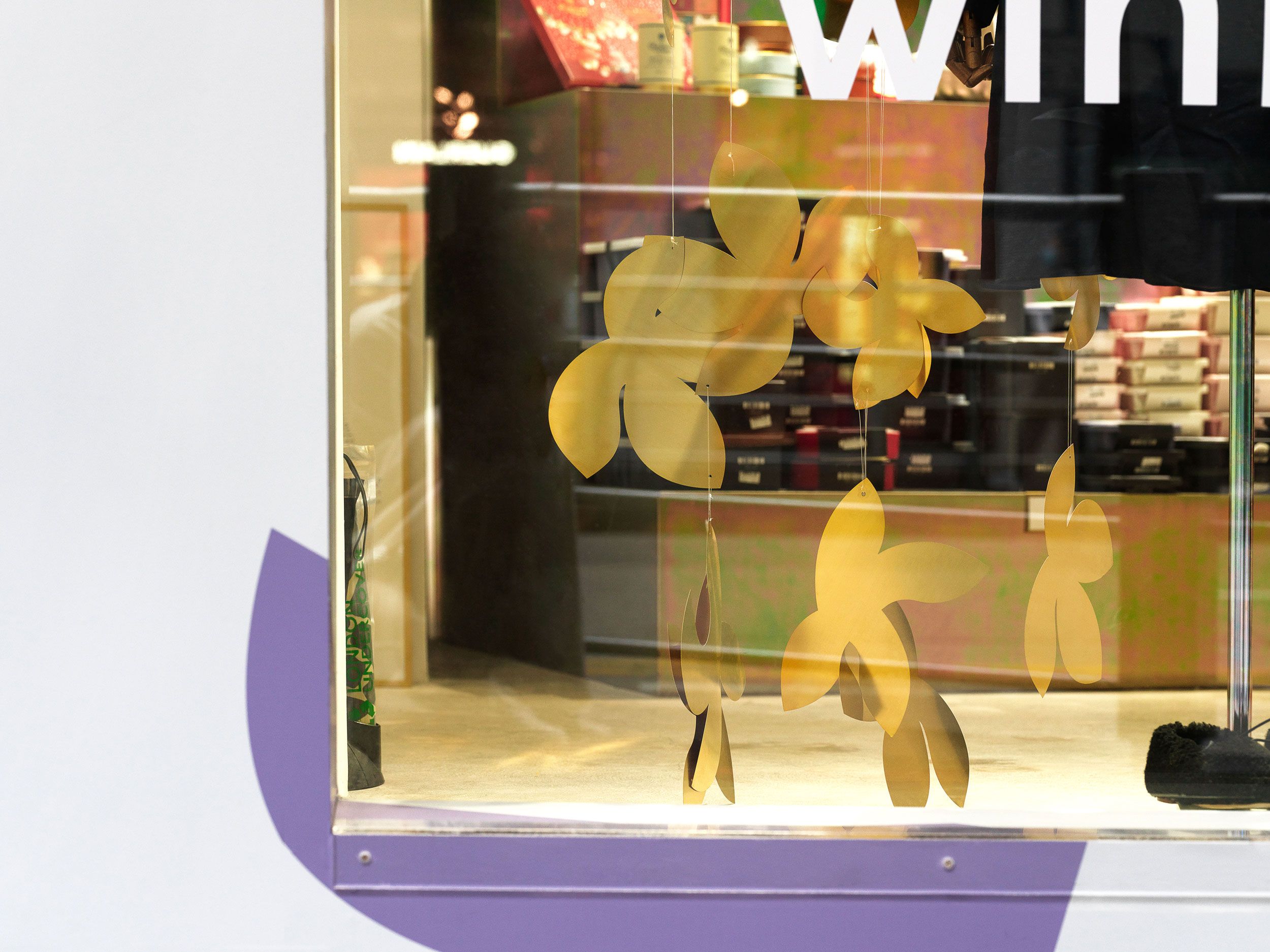
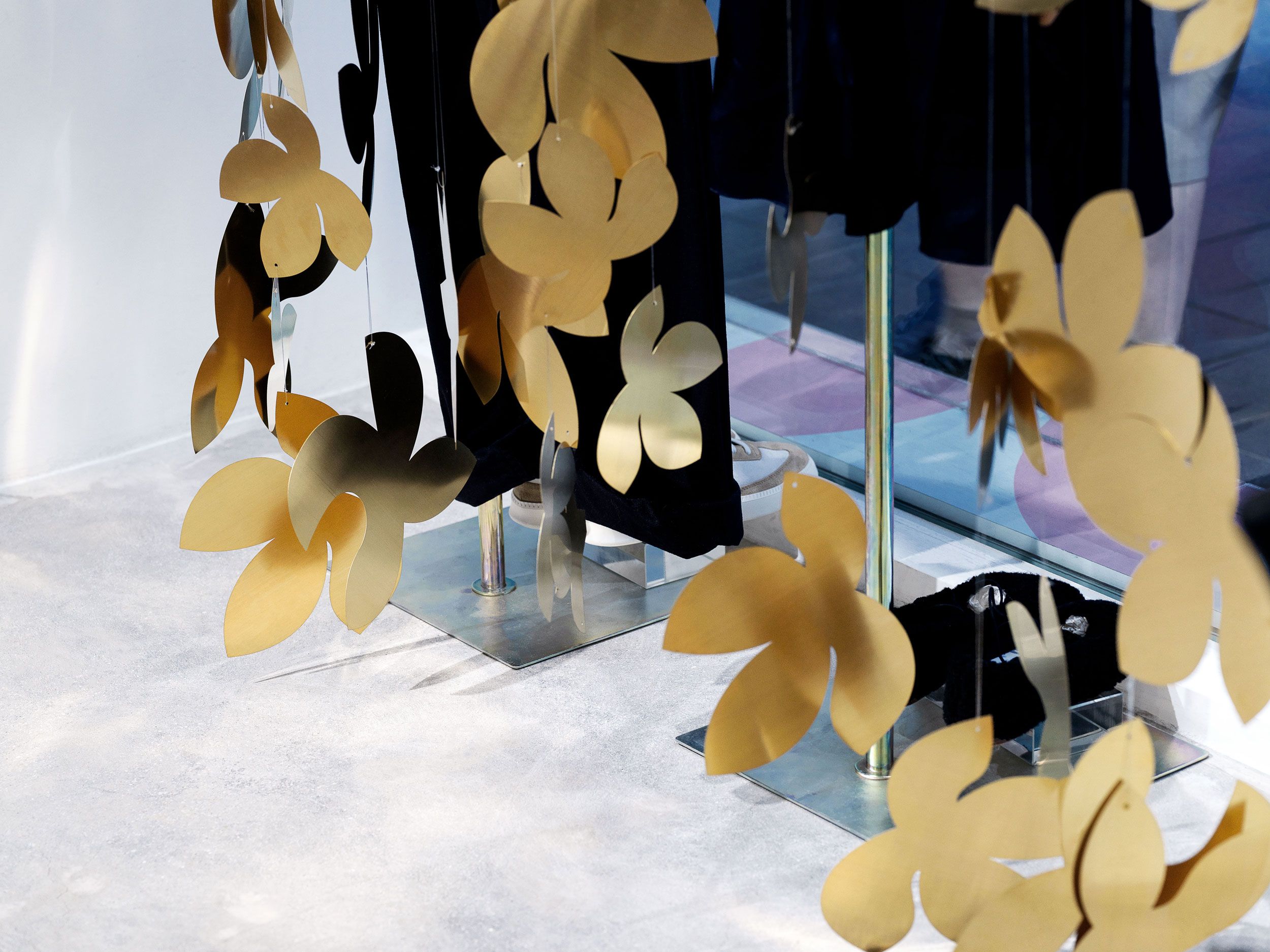
Visual identity for 15th anniversary of Hong Kong’s finest selective store, kapok. Brief was simple and challenging at the same time. A friendly, colourful and flexible system that can be used for every medium available: from street posters and social media announcements, stores front decorations and gift packaging, to collectable items created in collaborations with different brands like t-shirts, bags, candles, candy.
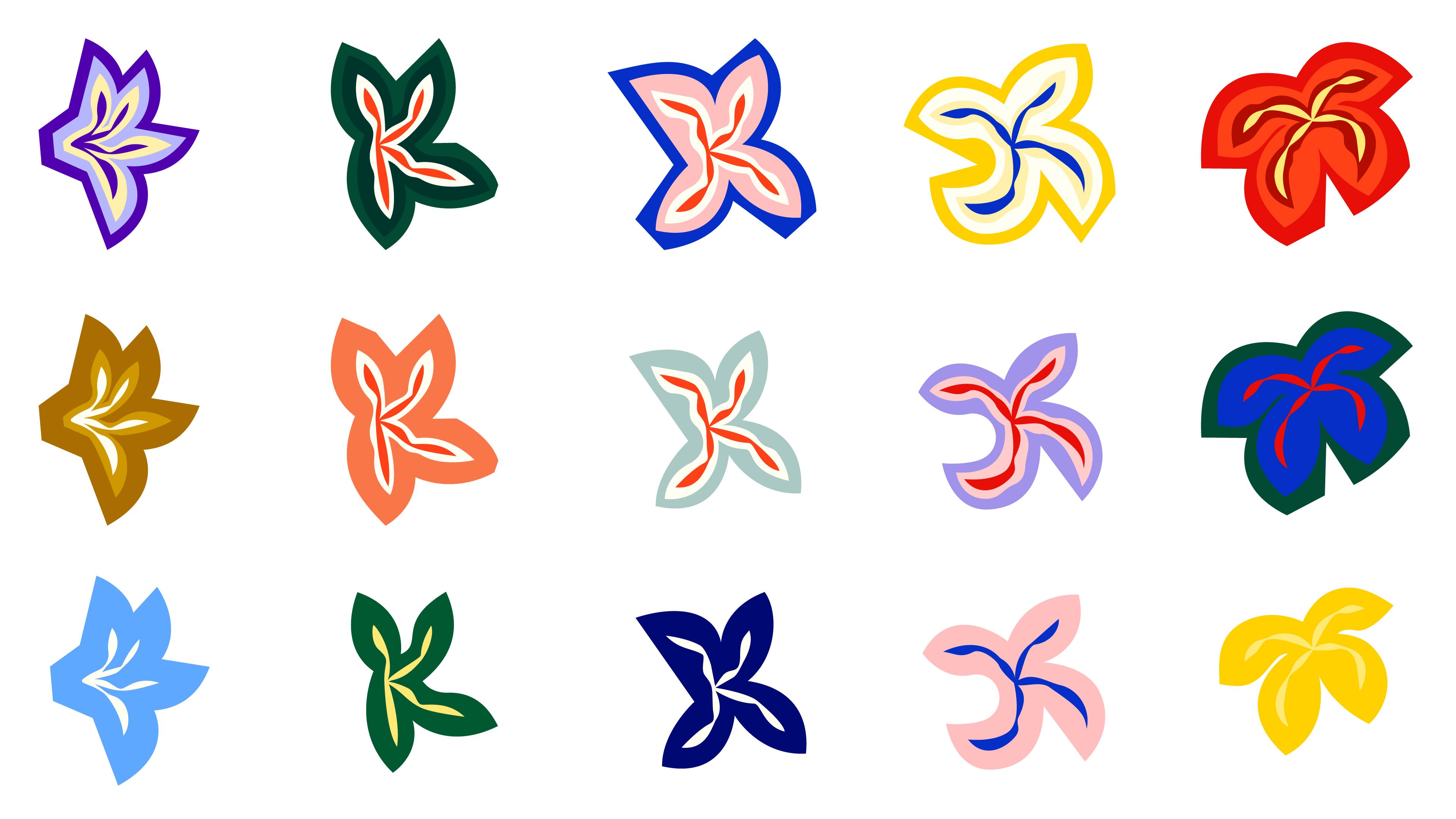
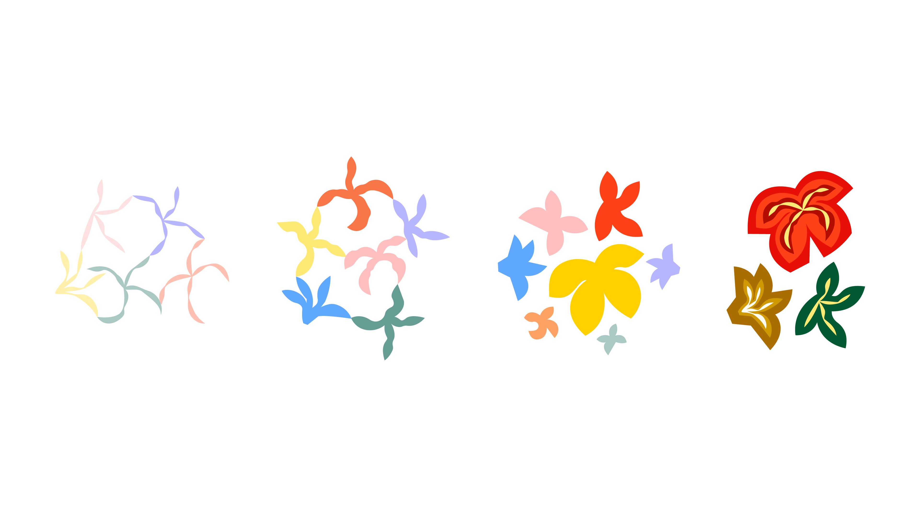
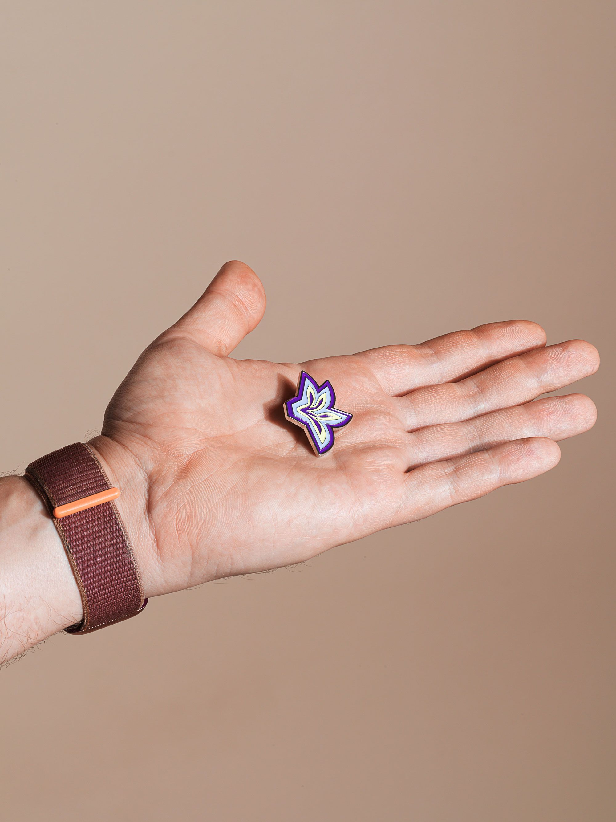
What can bring celebrative mood better than flowers? Plenty of flowers! We created a variable interplay of the kapok flower shape and glyph “k”. k-flowers can be combined together to create layers and joint patterns, or serve as a solo key visual. In combination with extended colour pallet our system allow infinite combinations.
Playful system helps making collectable objects only slightly branded, yet memorable.

Think we’d be a great fit for your brief?
Drop us a line to [email protected]