Brand identity, website and packaging for tonic mixers
Bubble language. The Carbonation
0
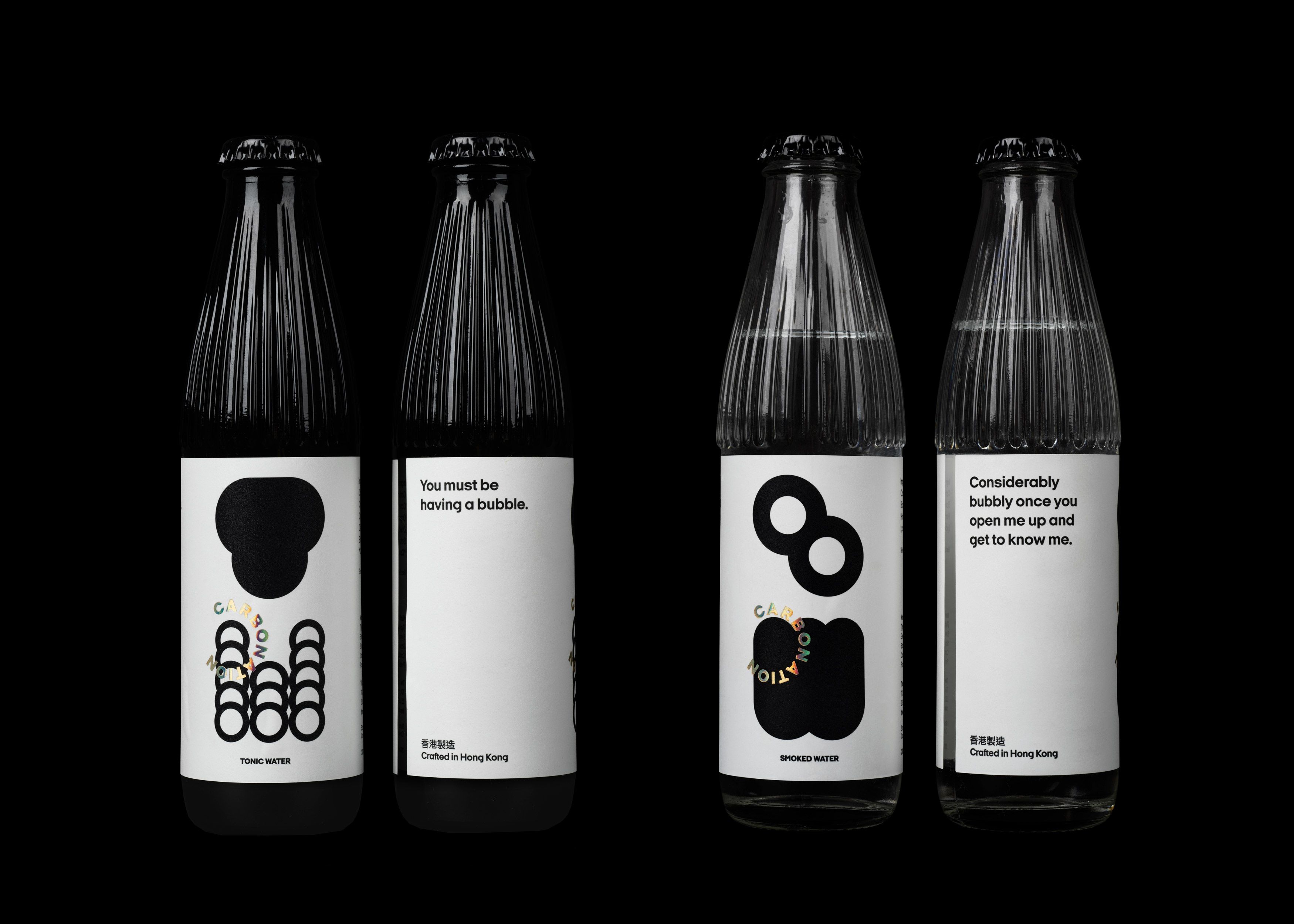
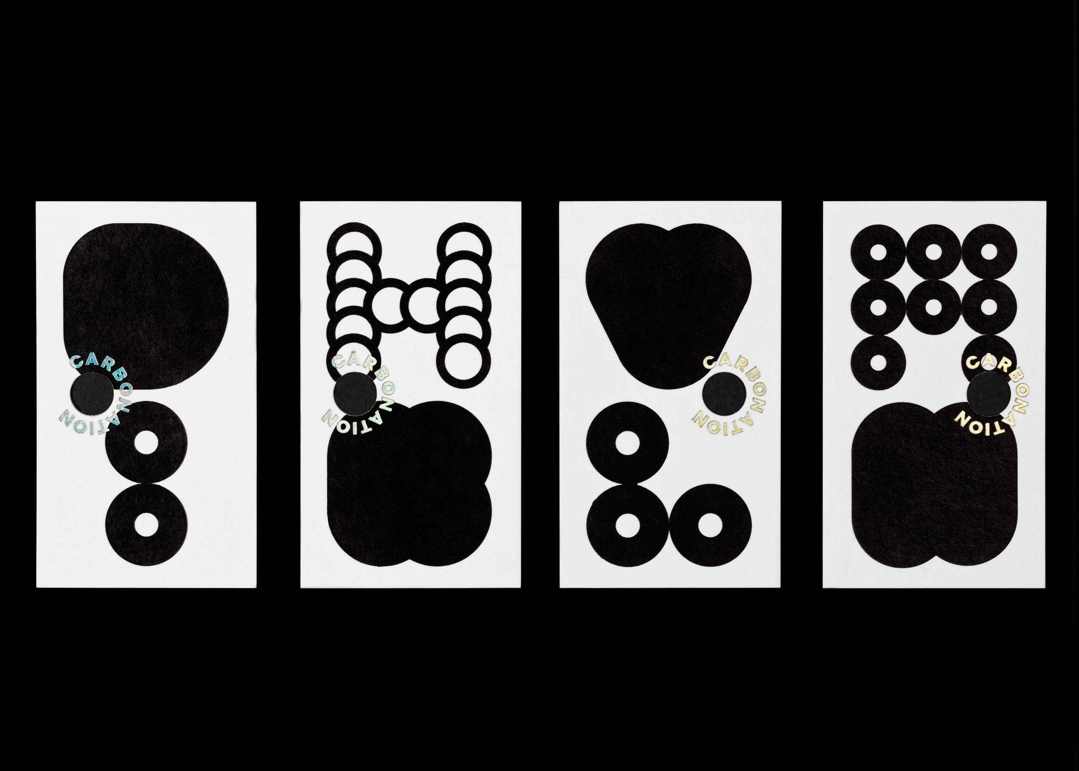
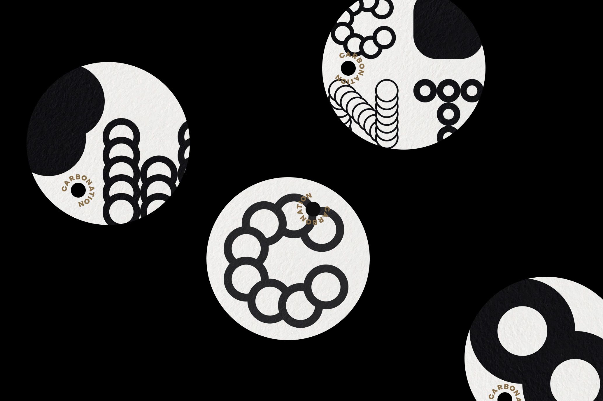
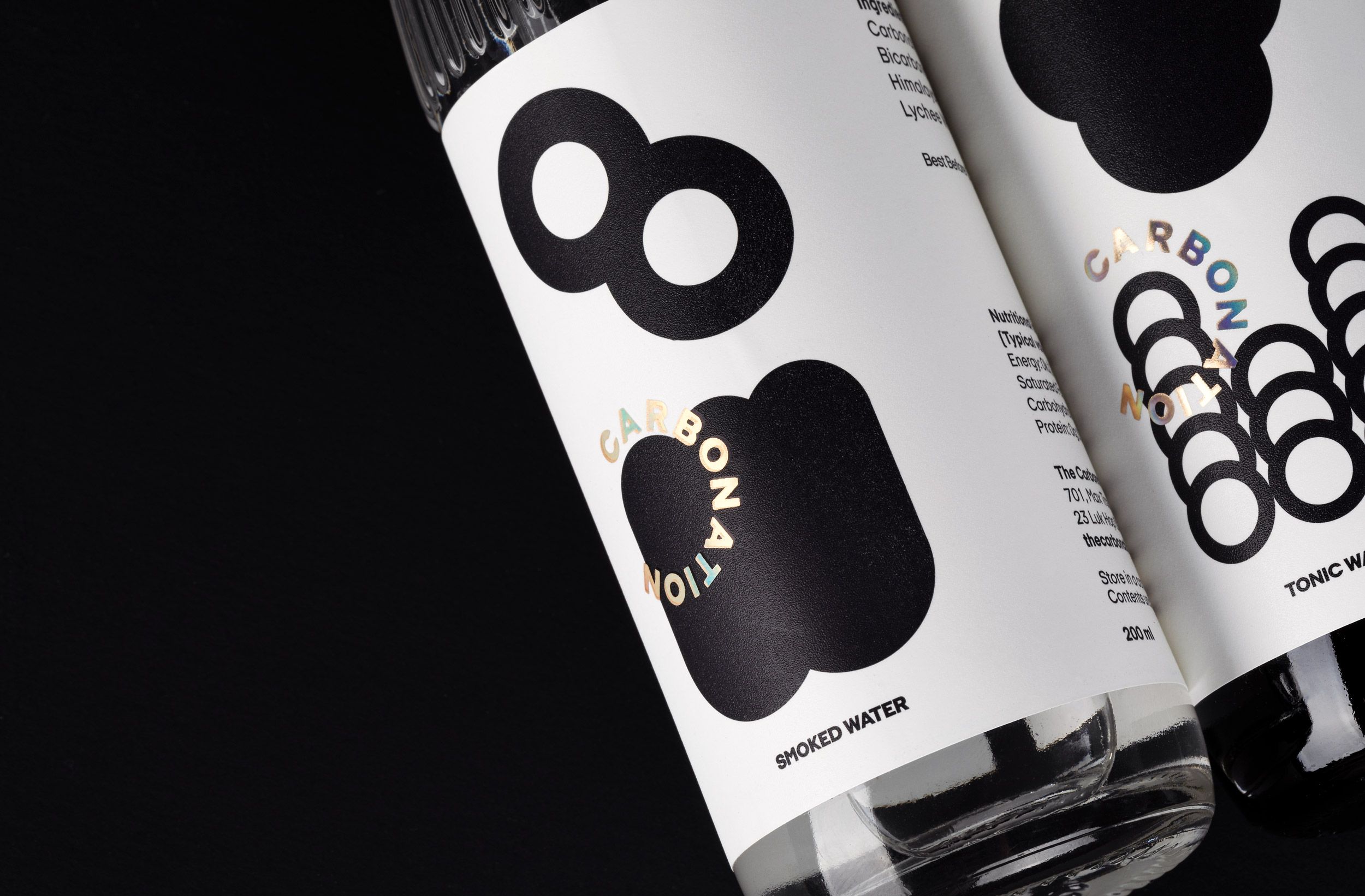
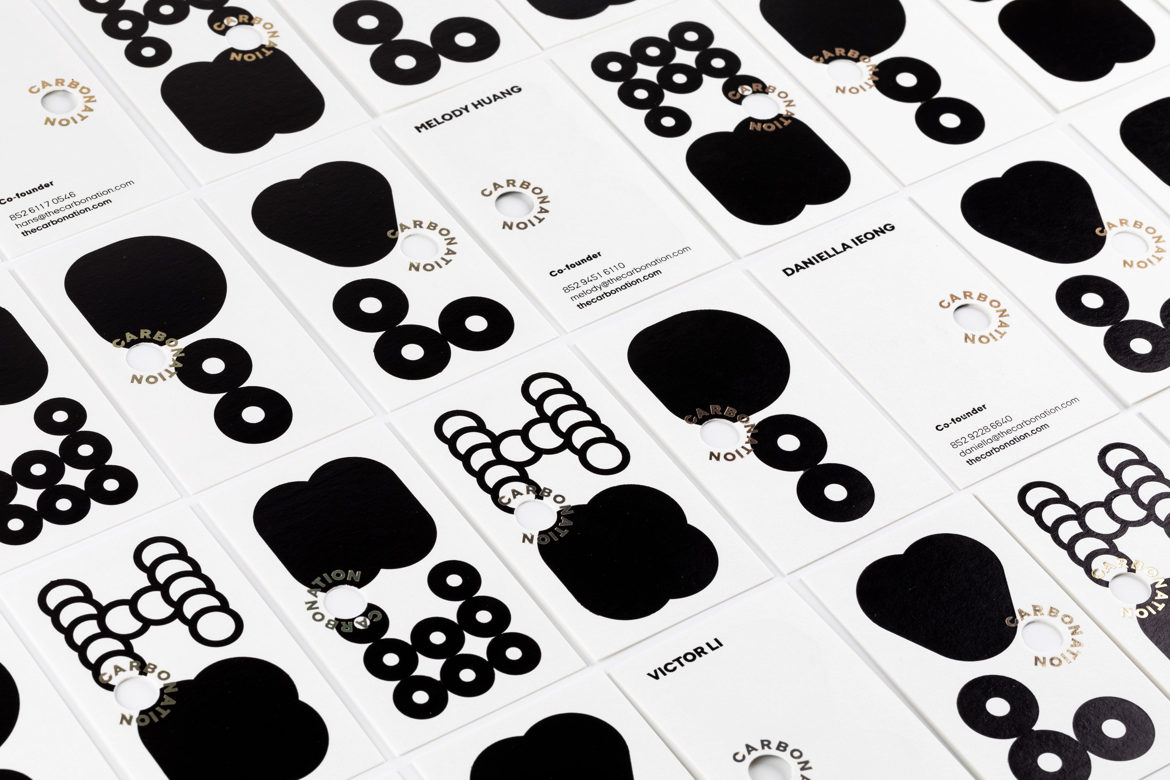
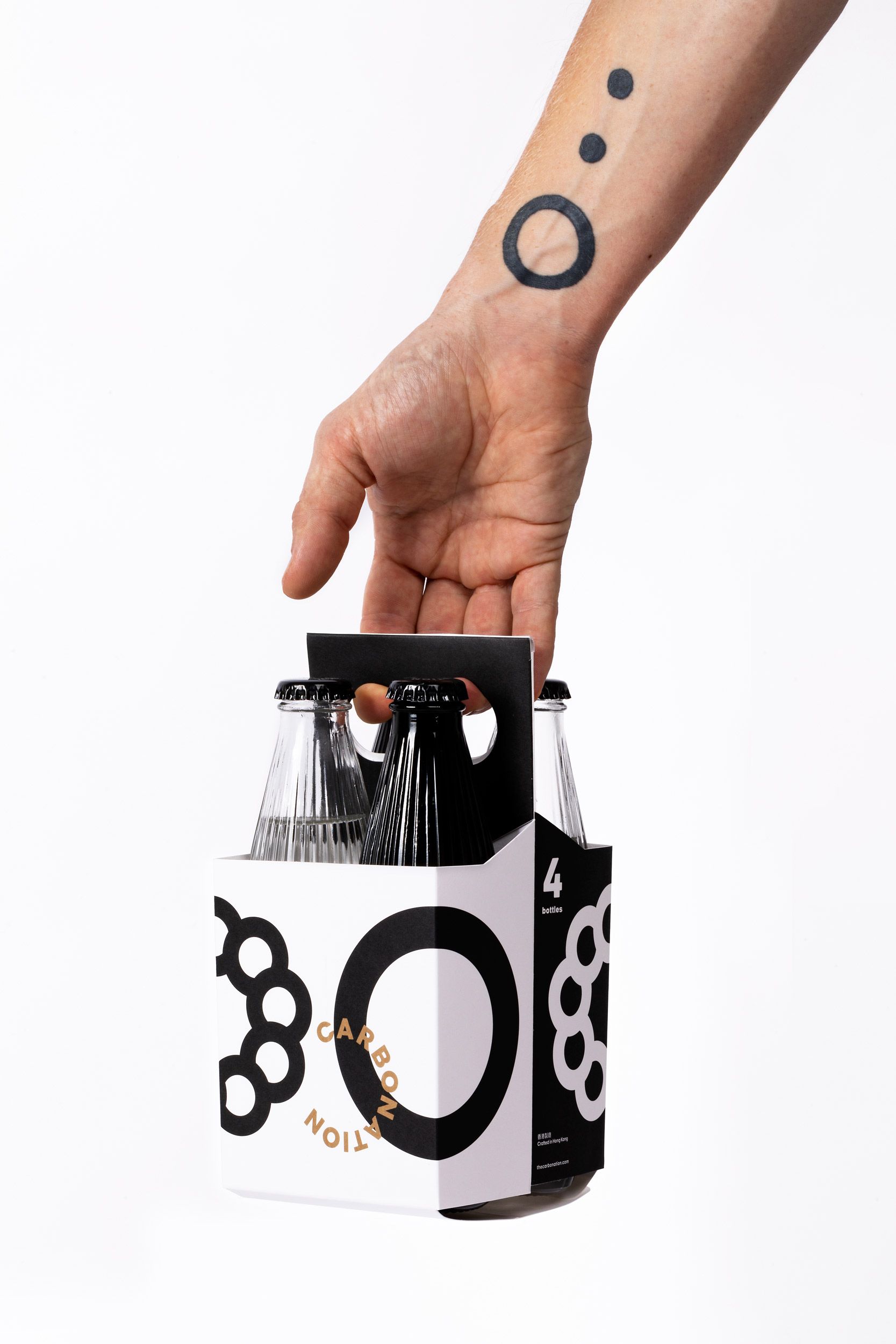
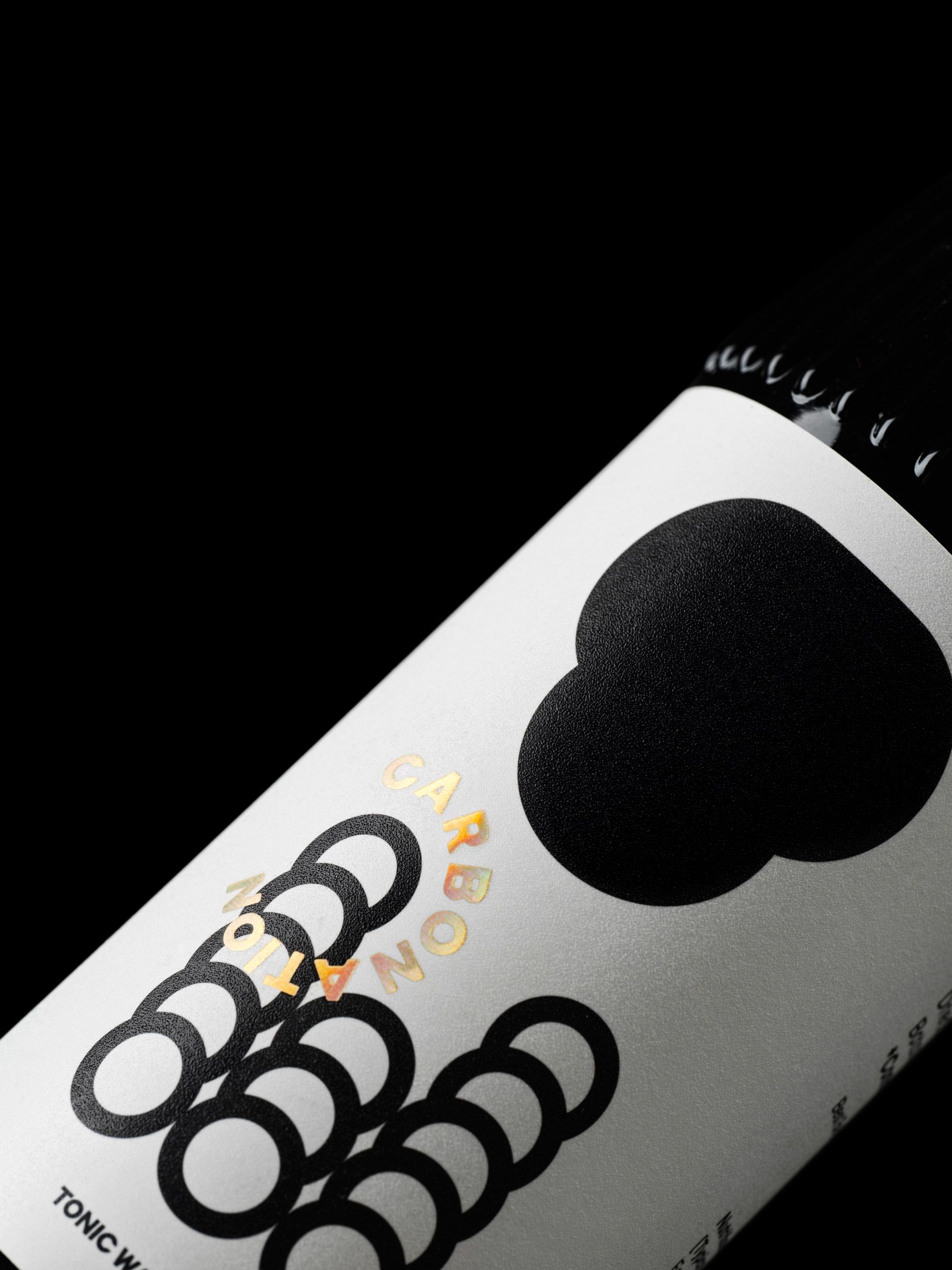
Carbonation is an independent brand of fizzy cocktail mixers from Hong Kong. We have developed it’s full brand identity with a strong focus on packaging: labels, boxes, sleeves and bottles. Visual language of the identity is based on basic bubble shape that forms a whimsical secret alphabet to convey brand’s message of concealed local aesthetic and exclusivity. It is playful and eye catchy, yet mature and smart. Even the logo easily becomes part of artistic interplay as it follows round shape. Bubble shape is also used for crafty die cuts that form another graphical layer to complement visual system. It serves as a centrepiece element for applications as bottle opener, business cards, coasters.
Do not miss website https://thecarbonation.com
Featured on:

Typeface:
The team:
Alice Mourou
Creative director, art director
Alan Wa Lun Wong
Designer
Nikita Shchukin
Motion graphic
Think we’d be a great fit for your brief?
Drop us a line to [email protected]