Real estate & Gallery
Tempting whirl — LURE
0
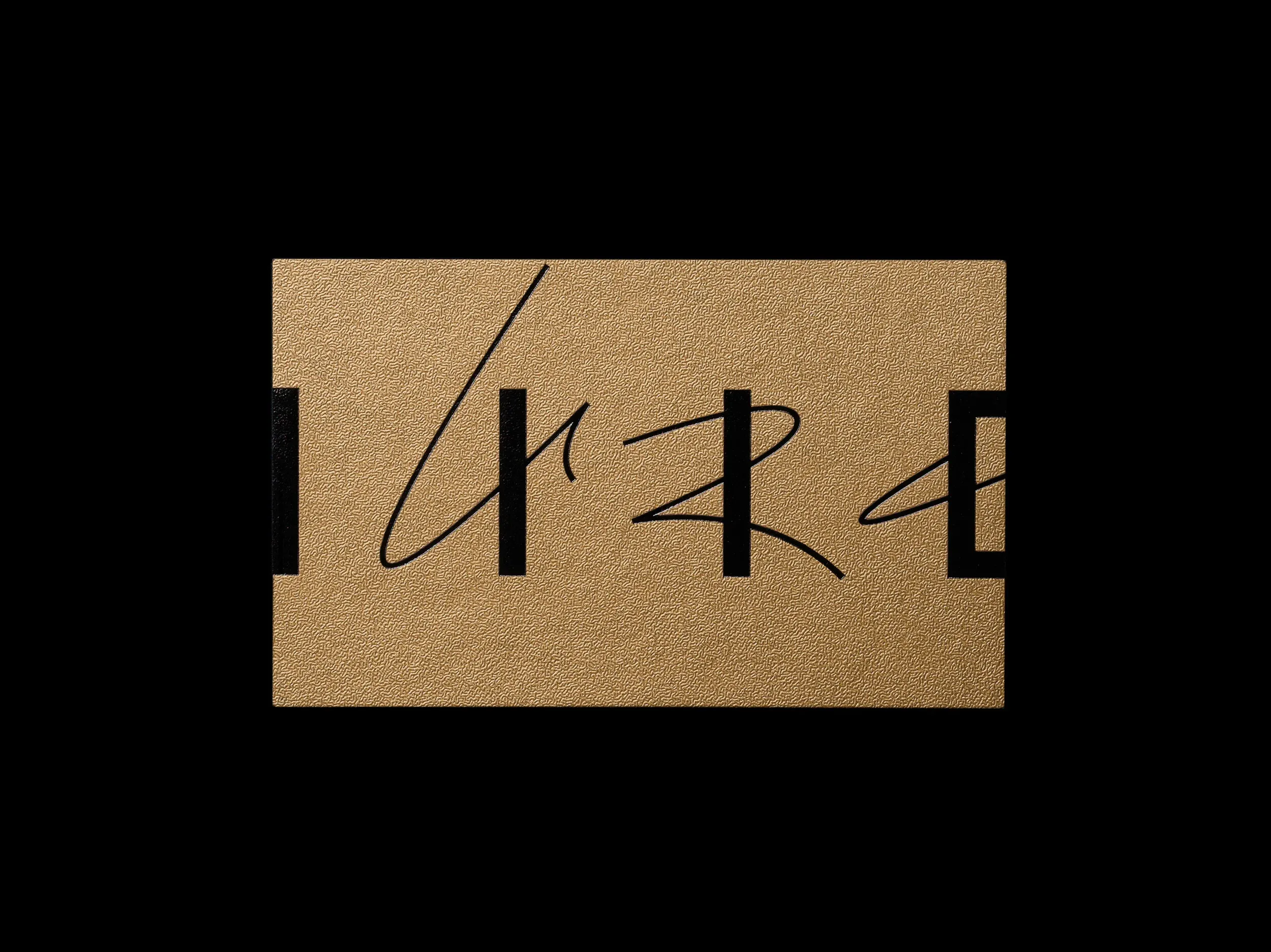
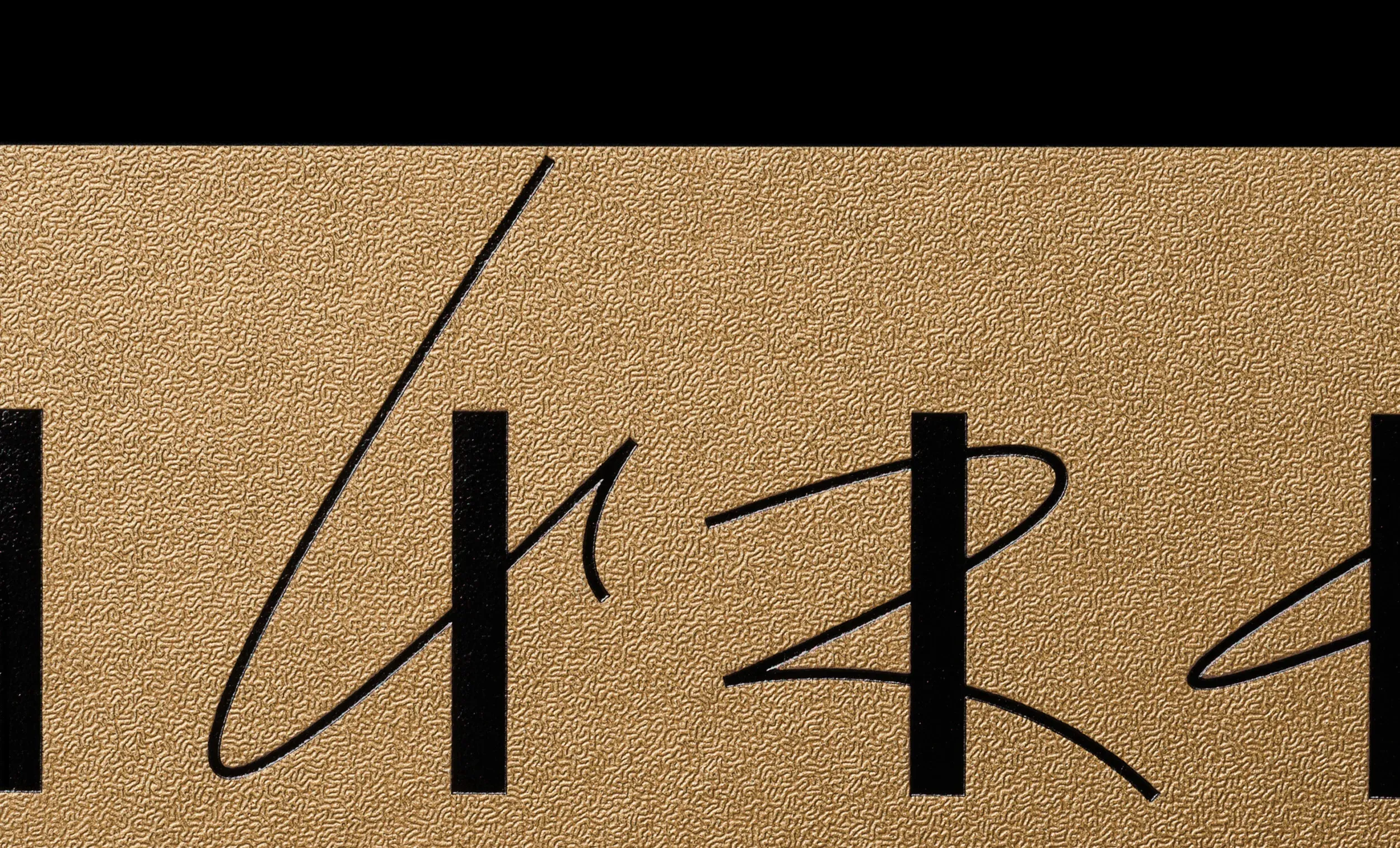
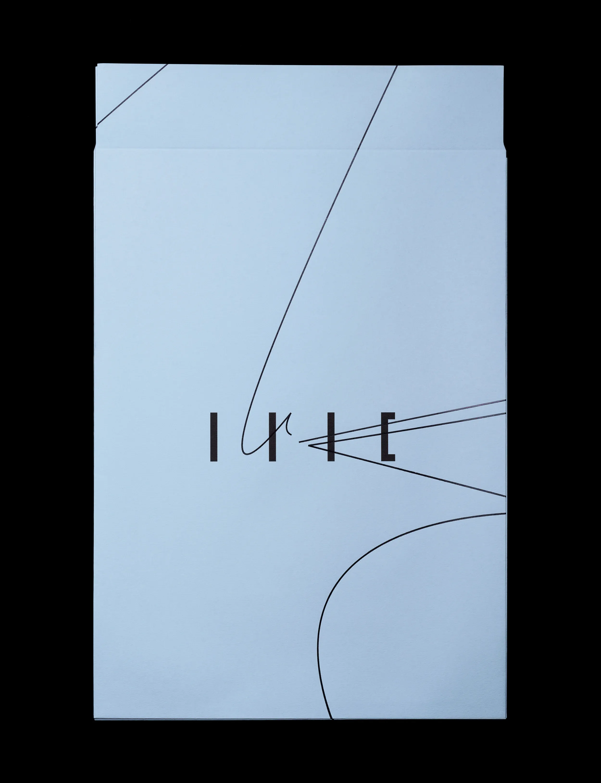
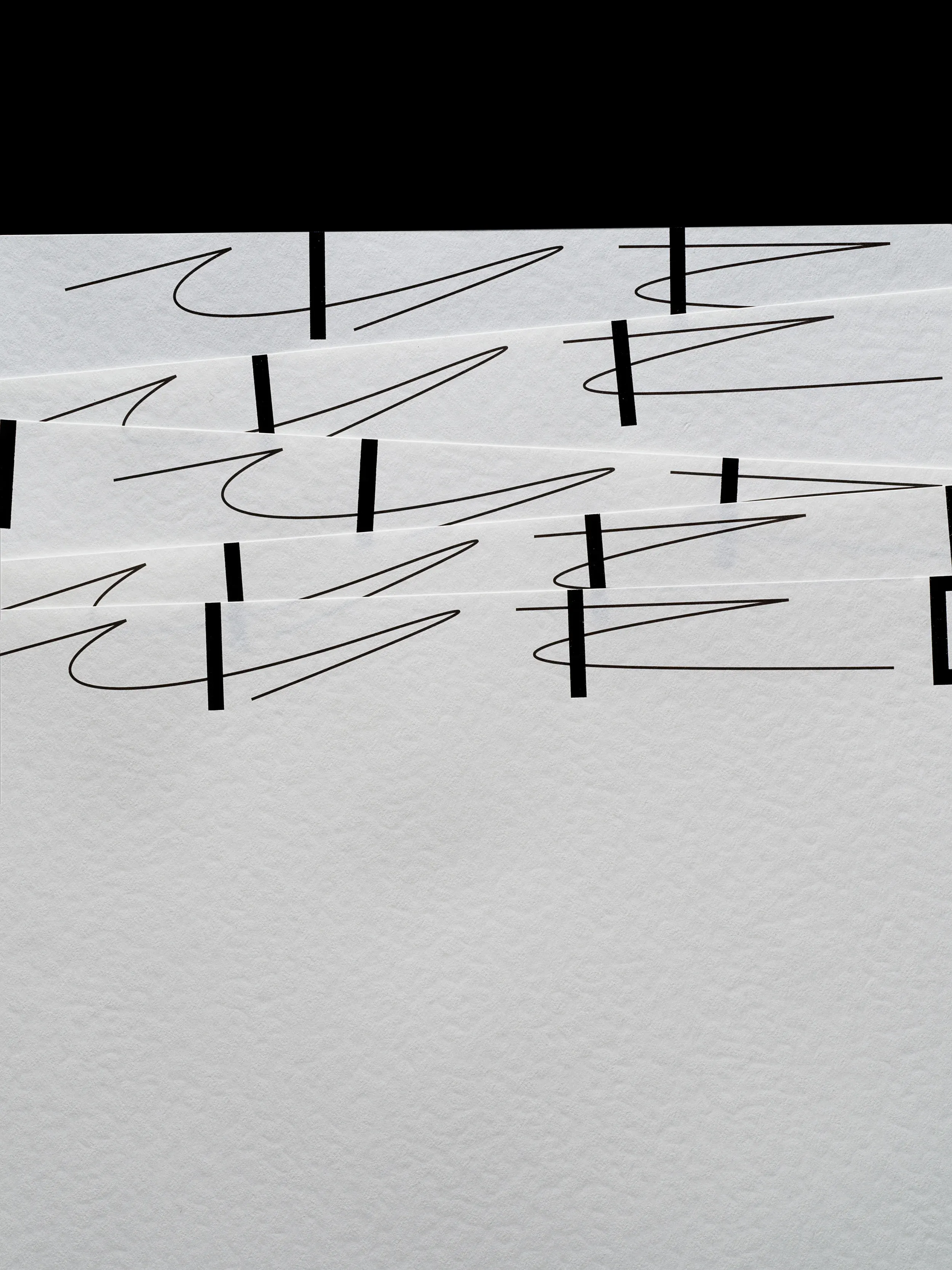
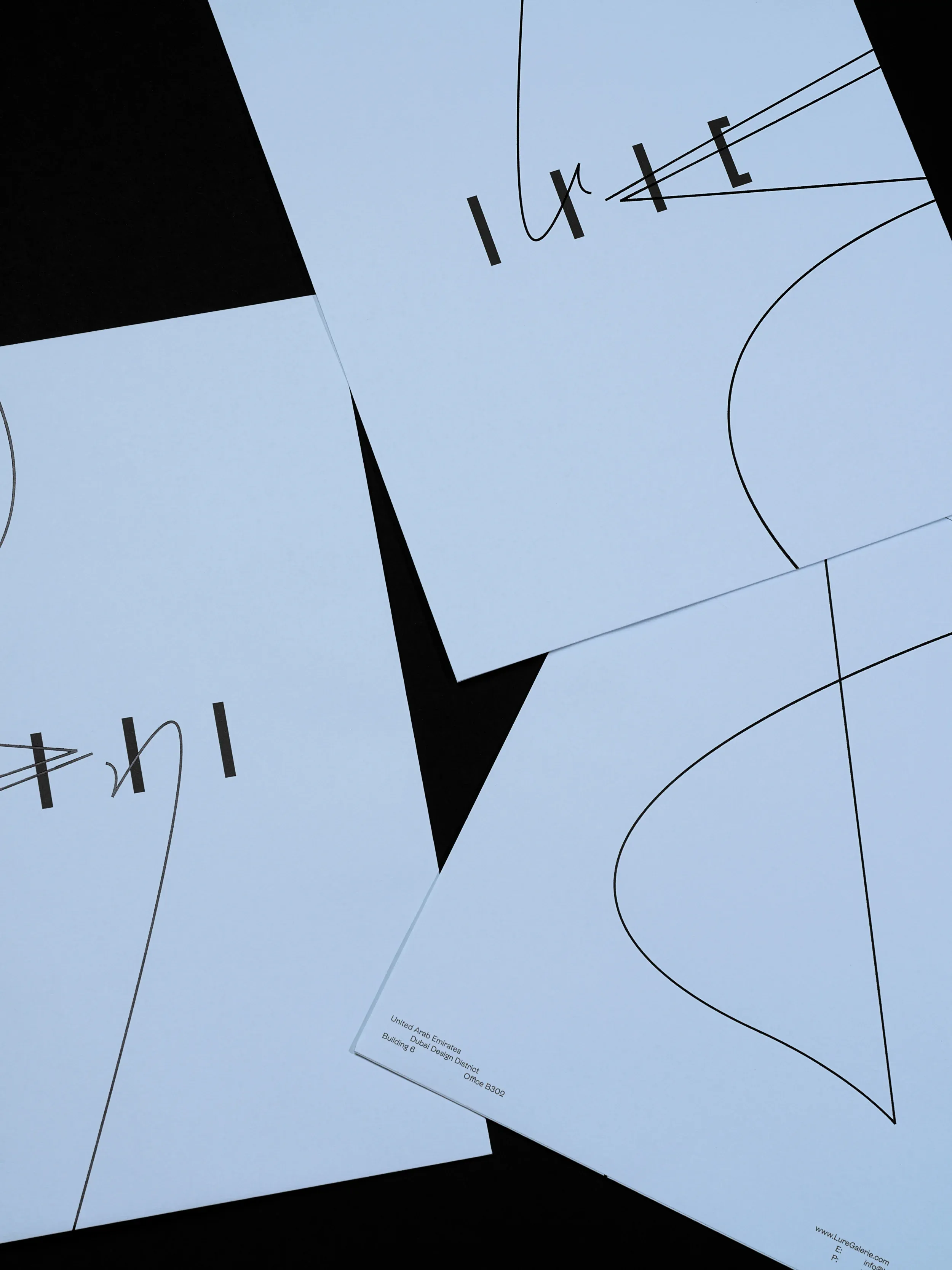
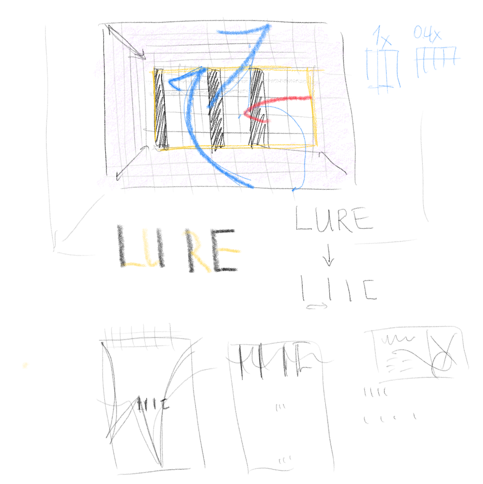
A logotype for Dubai based woman led luxury real estate agency and lifestyle gallery LURE is remarkably feminine. It takes inspiration from abstract dance movements presenting a metaphor of a tempting whirl around a dream space – a beautiful house.
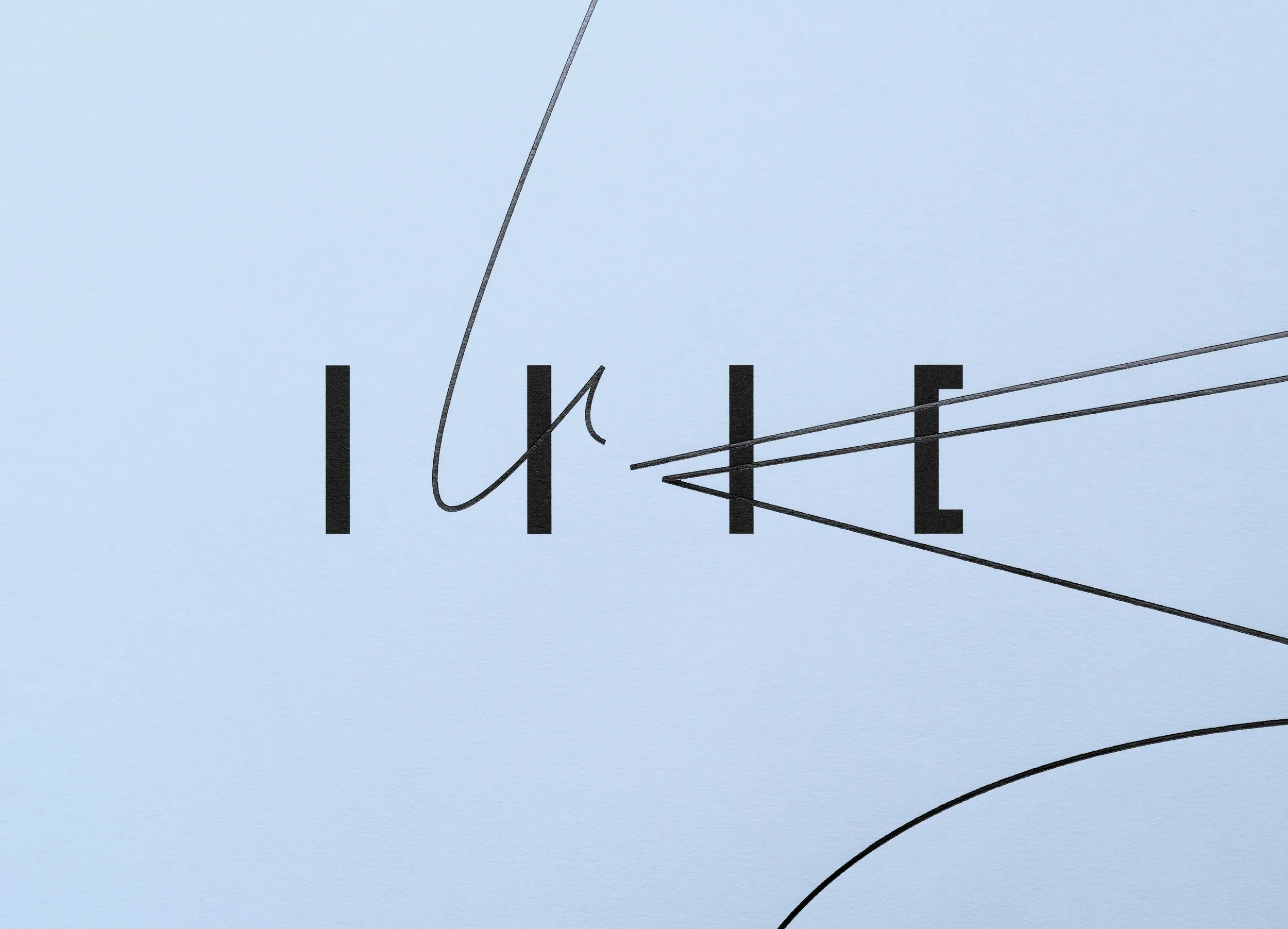
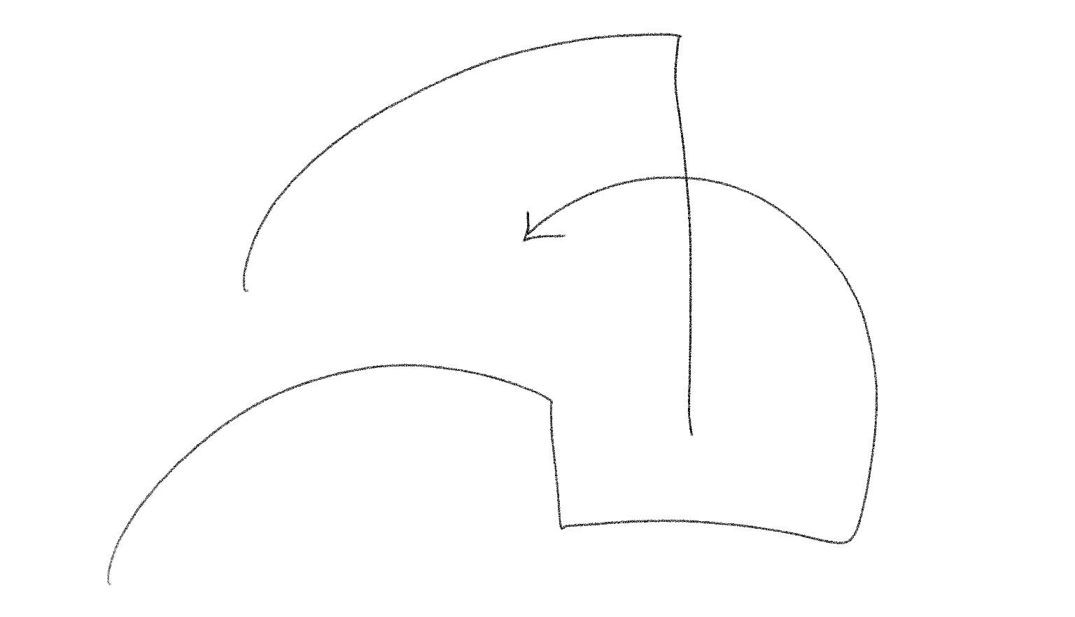
Glyphs of the name were deconstructed into steams reminiscent of an architectural structures and expressive free flowing curves complete the logotype with its signature energy.
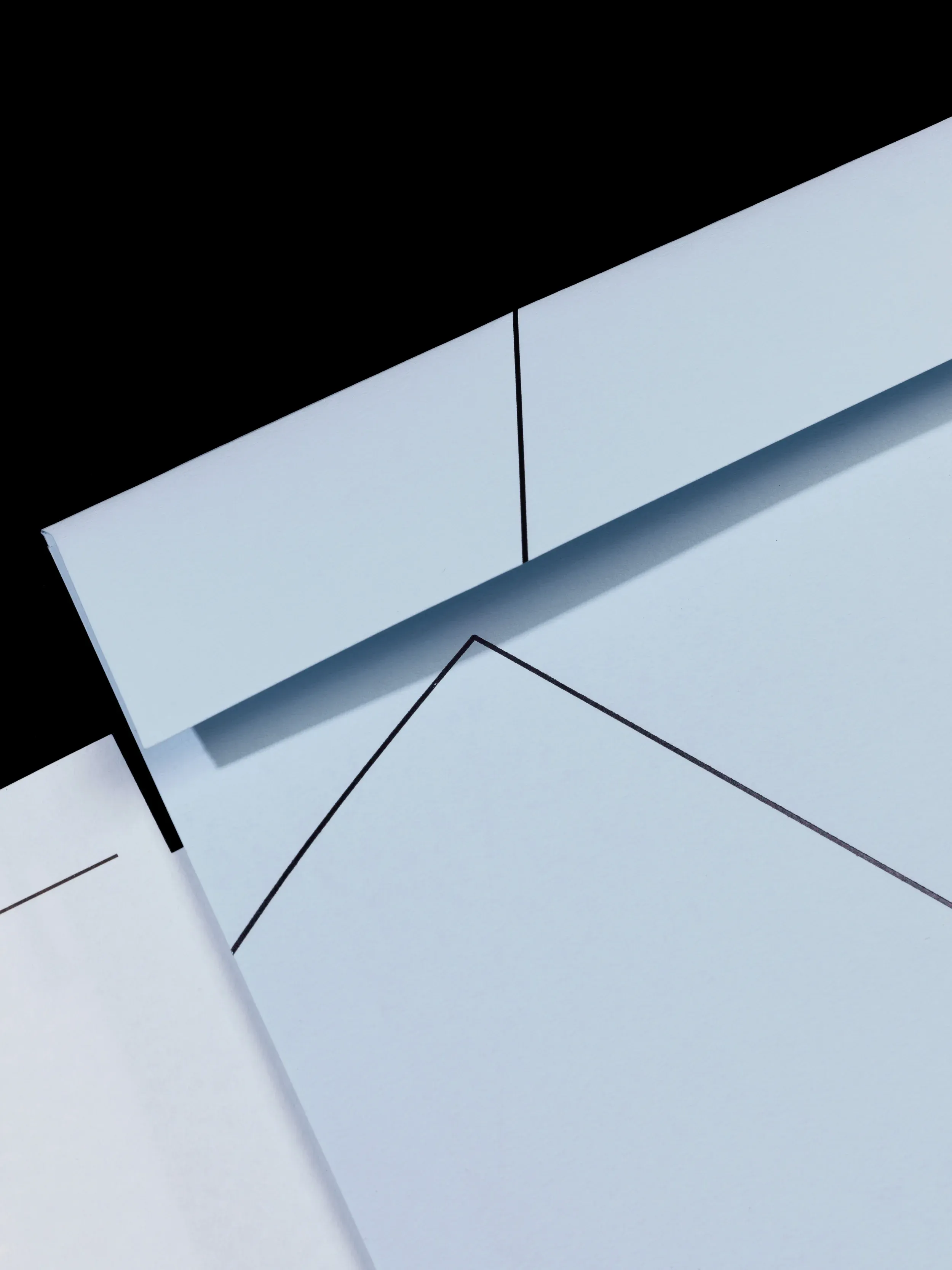
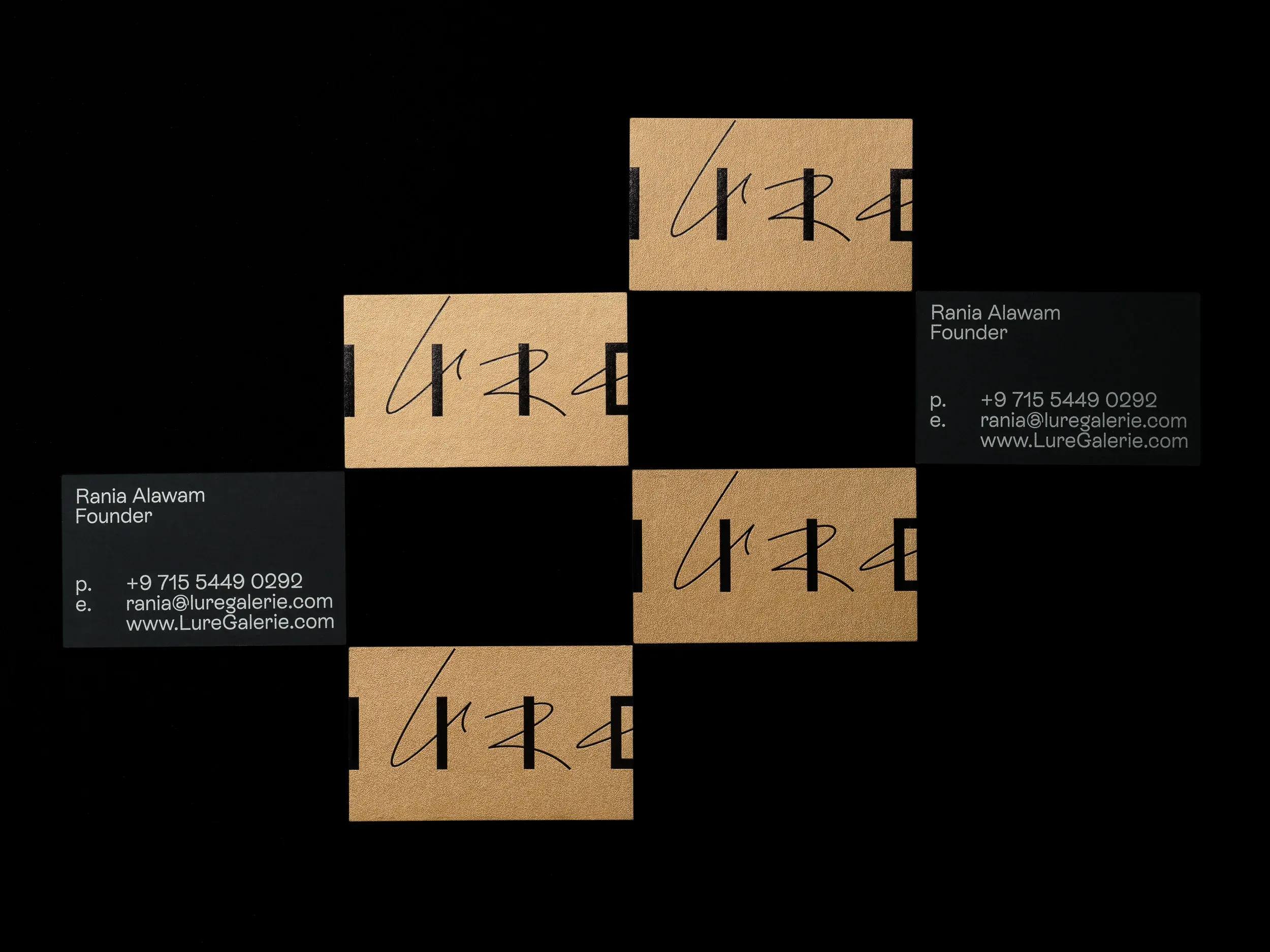
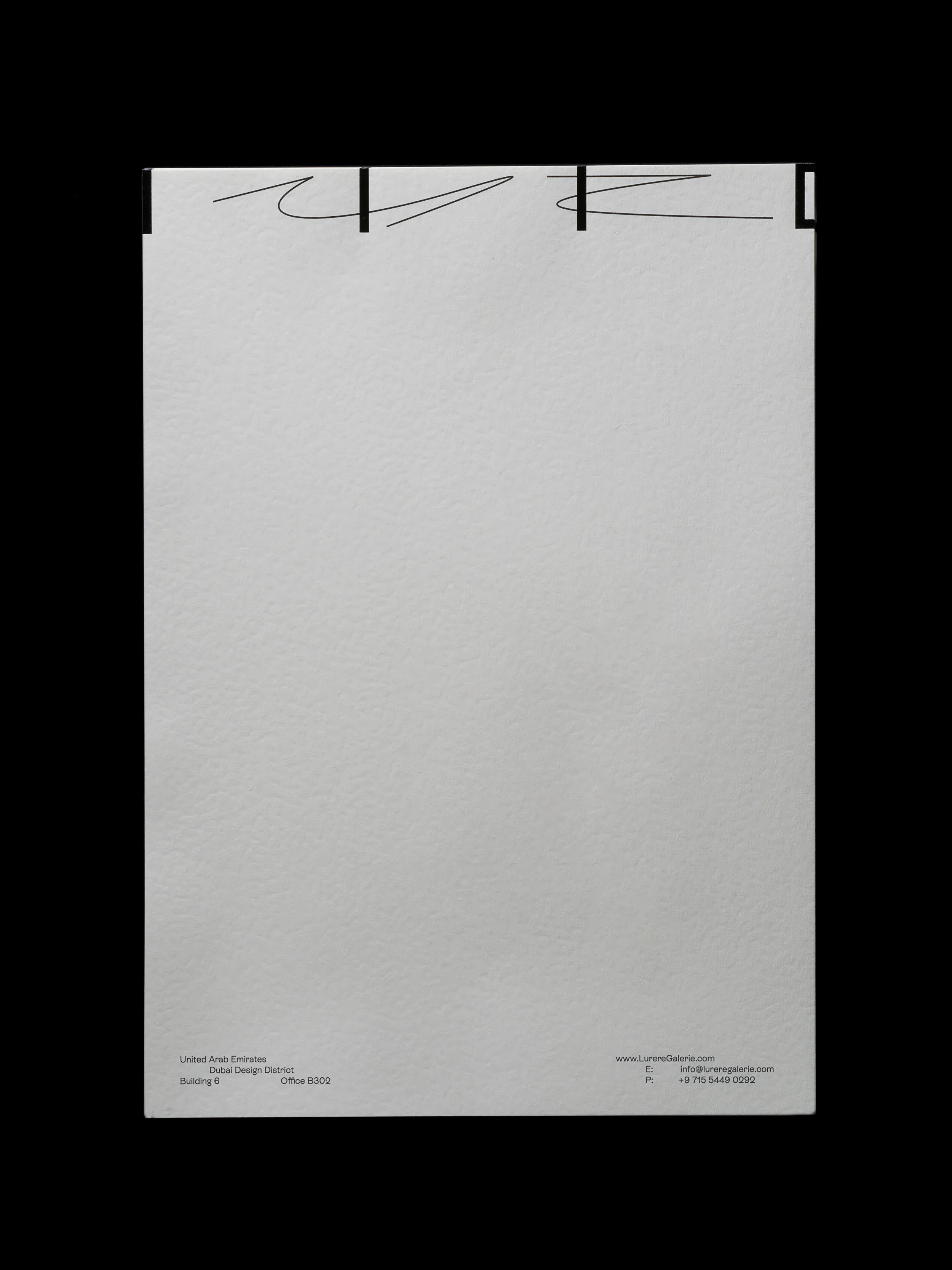
It is flexible. It evolves from compact symbol into spacious graphics for stationary, versatile digital formats and beyond.
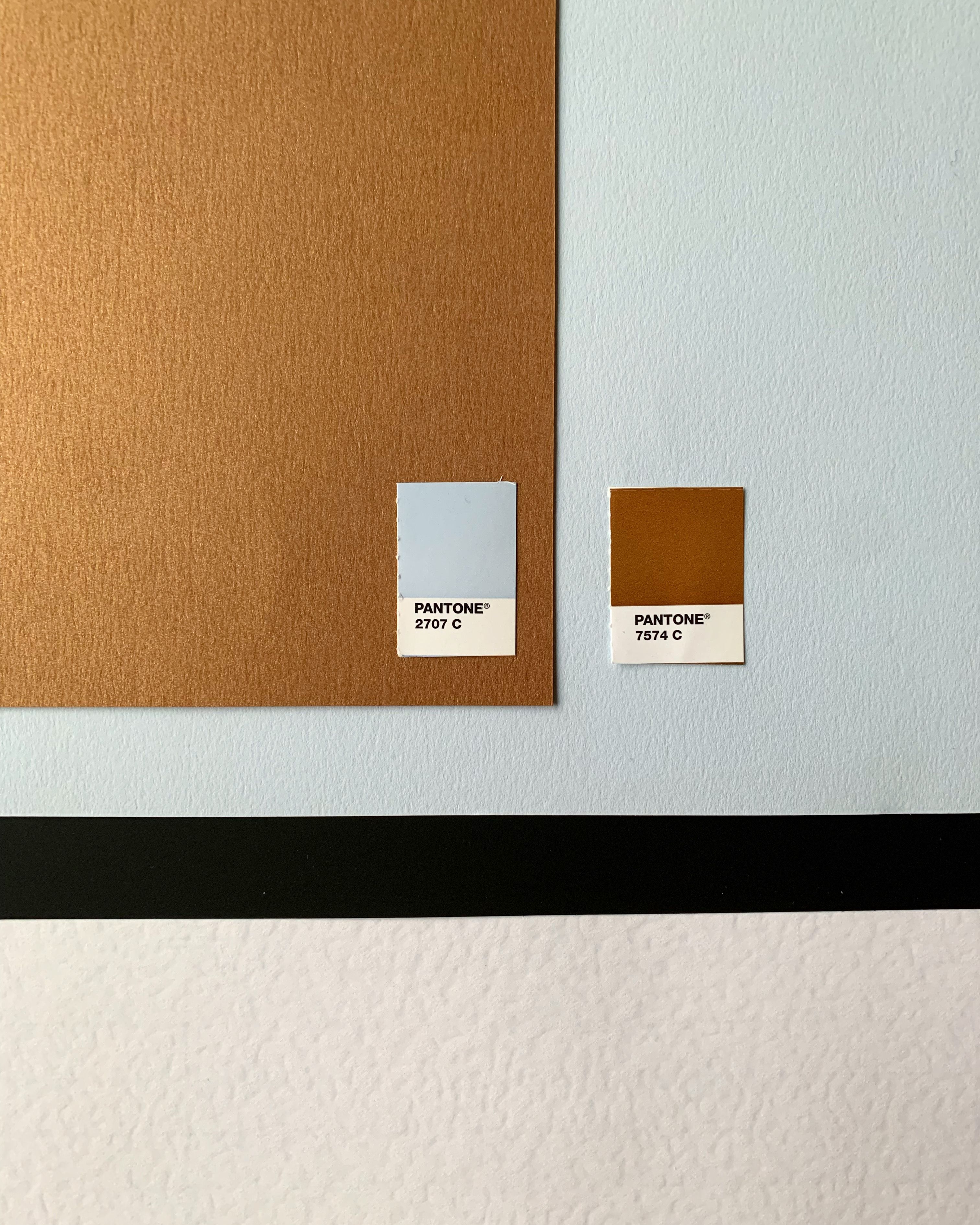
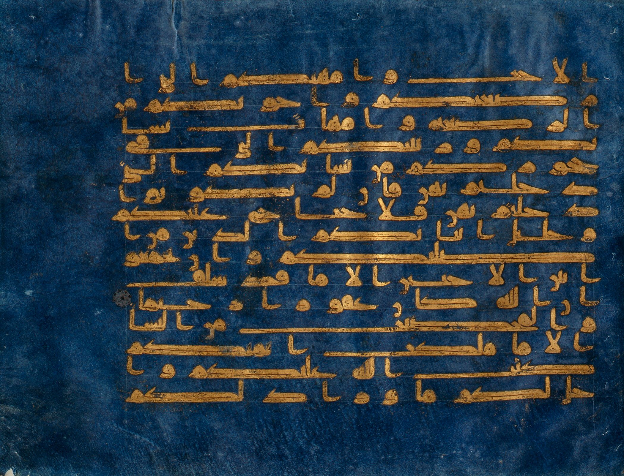
Brand identity colour palette composed with sky blue, sparkling gold, concrete grey and white cloud-like textured Conqueror Contour paper creates tranquil atmosphere.
Typesetting emphasises movement via spacing between blocks, remaining minimal with sizes and styles. The font ES Rebond Grotesque is used.

Typeface:
Paper:
Antalis Curios Collection
Conqueror
Think we’d be a great fit for your brief?
Drop us a line to [email protected]
Real estate & Gallery
Tempting whirl — LURE
0
Think we’d be a great fit for your brief?
Drop us a line to [email protected]